Automating Bank Transfers for Nonprofits
Enhancing control, compliance, and automation for fiscal sponsors.
Skills Demonstrated: Interaction Design, UI Design, Product Strategy, UX Design

About Ribbon
Ribbon is a specialized banking and operational platform designed for fiscal sponsors—nonprofits that extend their tax-exempt status to smaller programs.
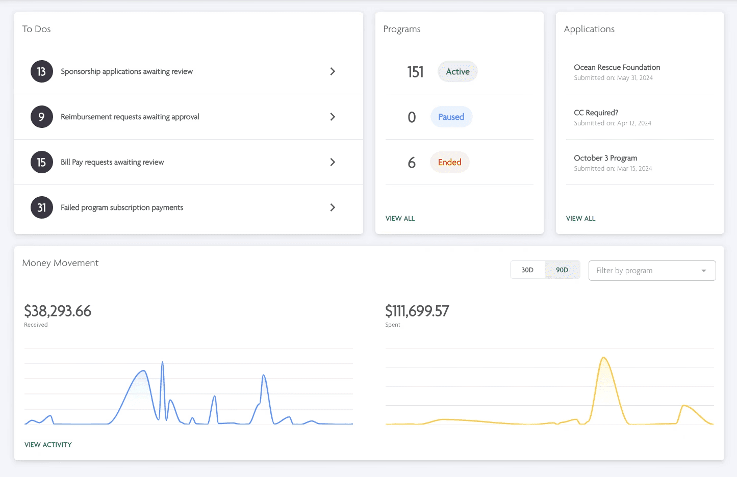
Ribbon enables these sponsors to manage multiple programs on a single platform, while also providing each program with a personalized view of their finances and operations.


Project Overview
Industry
Industry
Fintech
Timeline
Timeline
1 month
Team
Team
Product Designer (myself)
Head of Product
Engineering Team
Ribbon's platform bank account, entitled Ribbon Issuing, enables program members of Fiscal Sponsors to use Ribbon Spend Cards — Visa merchant cards that could be used in place of their own personal payment methods.
Many sponsors expressed that the lack of visibility into their Ribbon Issuing account caused a lack of trust and confidence in the platform.
Our incredibly minimal UI on the Ribbon Issuing Account page needed to evolve, and I was tasked with identifying the key user pain points and designing an enhanced experience that promotes control, compliance, and automation within Fiscal Sponsor banking.
NOTE: "User" and "Sponsor" are used interchangeably, as fiscal sponsors were the core users of this flow.
Ribbon's platform bank account, entitled Ribbon Issuing, enables program members of Fiscal Sponsors to use Ribbon Spend Cards — Visa merchant cards that could be used in place of their own personal payment methods.
Many sponsors expressed that the lack of Visibility into their Ribbon Issuing account caused a lack of trust and confidence in the platform.
Our incredibly minimal UI on the Ribbon Issuing Account page needed to evolve, and I was tasked with identifying the key user pain points and designing an enhanced experience that promotes control, compliance, and automation within Fiscal Sponsor banking.
NOTE: "User" and "Sponsor" are used interchangeably, as fiscal sponsors were the core users of this flow.
Problem
Our UI lacked visiibility into Ribbon Issuing, leaving users (Sponsors) feeling a lack of trust, control, and confidence into their banking on Ribbon.
Our UI lacked visiibility into Ribbon Issuing, leaving users (Sponsors) feeling a lack of trust, control, and confidence into their banking on Ribbon.
Solution
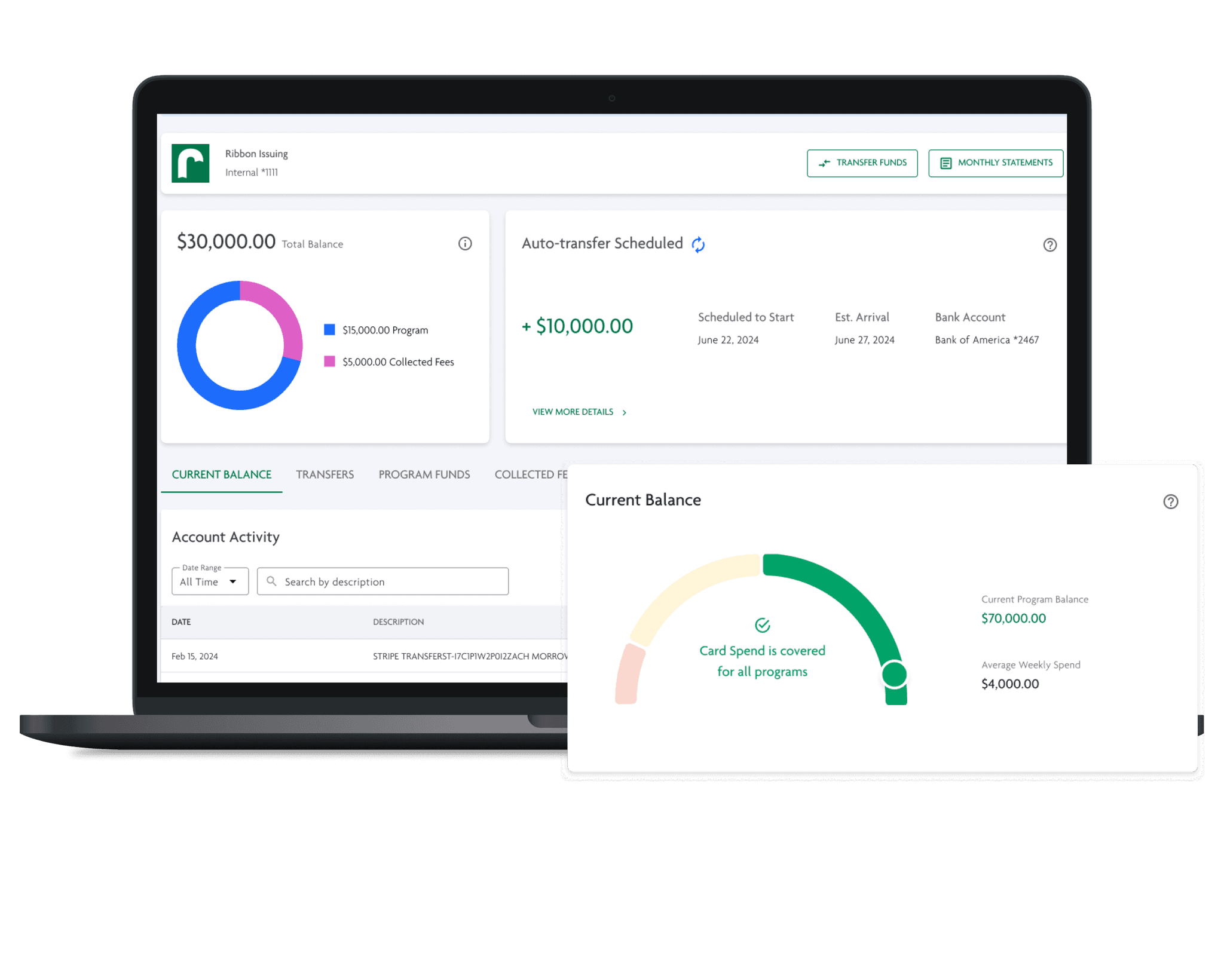
I identified the key pain points for our users, creating a redesigned Issuing experience that enables complete visibility into bank activity, automatic bank transfers, and introduces a manual bank transfer process for users.
I identified the key pain points for our users, creating a redesigned Issuing experience that enables complete visibility into bank activity, automatic bank transfers, and introduces a manual bank transfer process for users.
Results
Results


Improved visibility into Ribbon Issuing activity for Fiscal Sponsors.
Introduced complete control for users over their funds in Ribbon.
Created future iterations to extend access and control to sponsors.
Understanding the Problem
Understanding the Problem
Strategy
To kick off the Ribbon Issuing redesign, we first needed to identify and prioritize user problems. Knowing this would be a significant project, we carefully defined the project scope to ensure we addressed the most critical issues. I shadowed customer calls, reviewed support emails, and engaged with team members familiar with user concerns to gain a deeper understanding. Additionally, I audited the Ribbon Issuing page and observed sales calls to see firsthand how customers interacted with the platform. This research phase provided key insights that shaped our approach.
To kick off the Ribbon Issuing redesign, we first needed to identify and prioritize user problems. Knowing this would be a significant project, we carefully defined the project scope to ensure we addressed the most critical issues. I shadowed customer calls, reviewed support emails, and engaged with team members familiar with user concerns to gain a deeper understanding. Additionally, I audited the Ribbon Issuing page and observed sales calls to see firsthand how customers interacted with the platform. This research phase provided key insights that shaped our approach.
To kick off the Ribbon Issuing redesign, we first needed to identify and prioritize user problems. Knowing this would be a significant project, we carefully defined the project scope to ensure we addressed the most critical issues. I shadowed customer calls, reviewed support emails, and engaged with team members familiar with user concerns to gain a deeper understanding. Additionally, I audited the Ribbon Issuing page and observed sales calls to see firsthand how customers interacted with the platform. This research phase provided key insights that shaped our approach.
Key Problems
Ribbon Issuing was initially designed to match the design patterns of other connected bank accounts on Ribbon, even though it functioned entirely differently. This misalignment caused sponsors to feel uncertain about the platform, reducing their confidence in how Ribbon Issuing operated and its value to their programs.
Ribbon Issuing was initially designed to match the design patterns of other connected bank accounts on Ribbon, even though it functioned entirely differently. This misalignment caused sponsors to feel uncertain about the platform, reducing their confidence in how Ribbon Issuing operated and its value to their programs.
Ribbon Issuing was initially designed to match the design patterns of other connected bank accounts on Ribbon, even though it functioned entirely differently. This misalignment caused sponsors to feel uncertain about the platform, reducing their confidence in how Ribbon Issuing operated and its value to their programs.
There are two types of bank accounts on Ribbon:
There are two types of bank accounts on Ribbon:
There are two types of bank accounts on Ribbon:
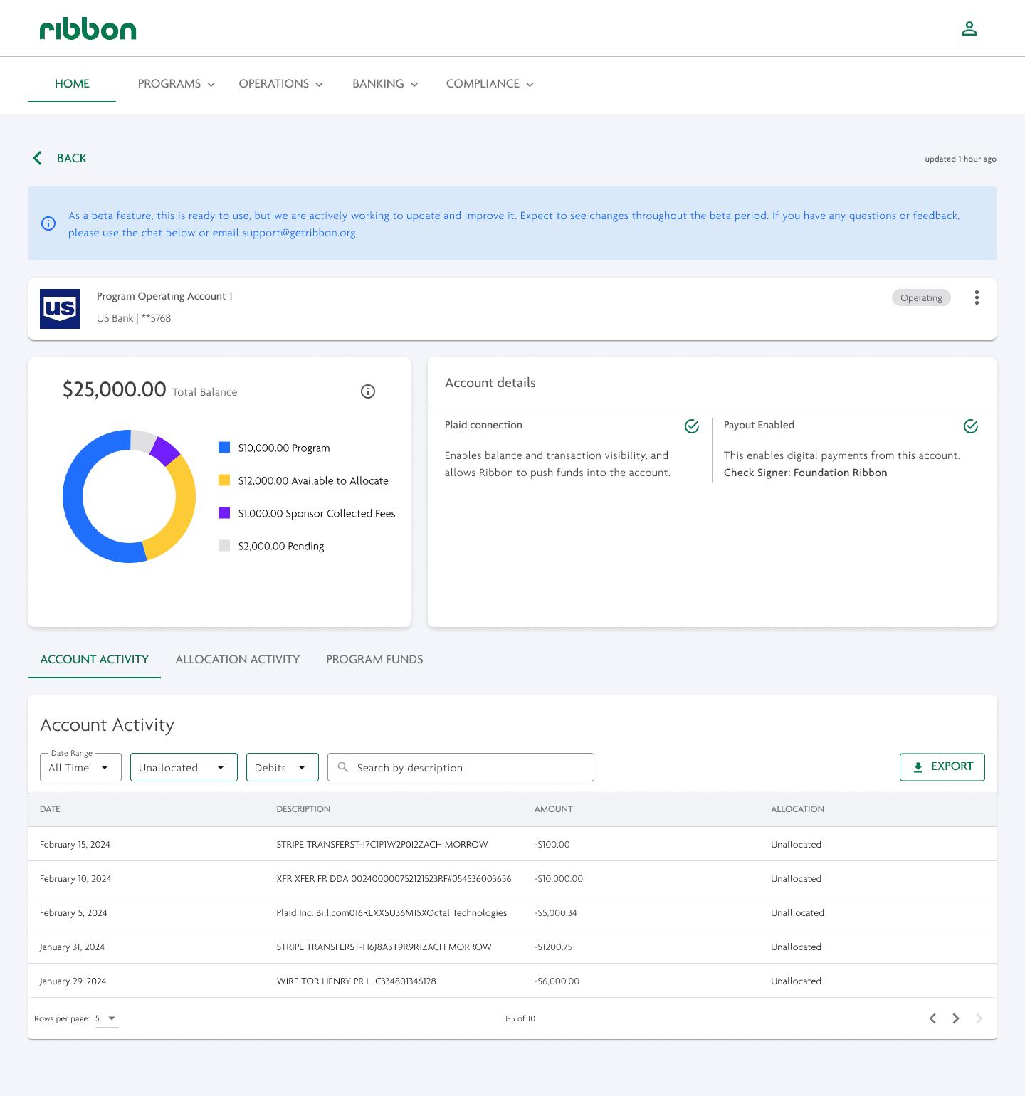


External Bank Account
Sponsor's existing account at a traditional bank (ex: Chase, Bank of America, etc.) that could hold both program and Sponsor operational funds. Ribbon provided a viewing access into those accounts and allowed sponsors to allocate funds from those accounts towards the Program's total balance
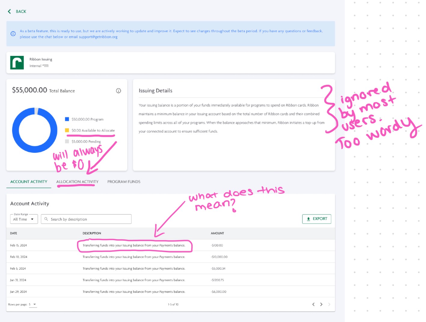


Ribbon Issuing
The Ribbon Issuing bank account automates program spending via the Ribbon Spend Card. Funded directly by donations, it ensures balances are automatically adjusted, allowing users to spend without needing reimbursement.
While the intention was automation, my research revealed users felt that this page provided the opposite:
Confusing UI: The design only showed irrelevant information to users while hiding the details they needed, causing users to reach directly to Customer Support to request necessary information for accounting.
Manual Top-Up Process: Sponsors received emails asking for permission to initiate top-ups, but there was no UI visibility, leading to accounting confusion when money was moved from the external accounts.
Fund Access Issues: Sponsors couldn’t easily transfer money in or out of Ribbon Issuing, unlike their external bank accounts, leading to concerns about control over their funds in case of emergency.
Design Process
Design Process
Given the complexity of this redesign, we needed a strategic approach. Our goal was to introduce new capabilities while creating a visual language that would help sponsors feel more confident in using Issuing and set the stage for future enhancements.
To navigate this, I developed a discovery design deck that documented my thought process, including rejected ideas, user research, and iterative progress. This deck kept the team aligned, provided clarity on decisions, and encouraged informed contributions to the design process.
The project was split into three core sections:
Clairfy the Ribbon Auto-Transfers process
Increase Access to Issuing Funds
Make Issuing data easier to understand
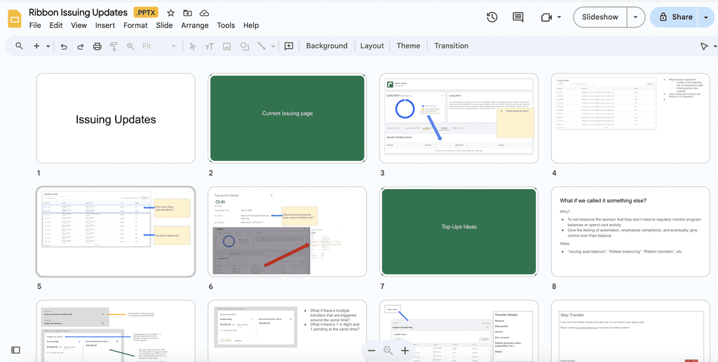

User need: Clarify the Ribbon Auto-Transfers process
The Issuing balance ensures that programs have sufficient funds on their Ribbon cards by maintaining a minimum balance, and when necessary, Ribbon initiates a "top-up" from the connected account. Previously, this was the extent of the explanation the user was provided. This did not, however, prevent confusion and frustration when said "top-ups" would occur.
We recognized that while it was crucial to provide more transparency around auto-transfers (or "top-ups") in Ribbon Issuing, we had to be careful not to overwhelm users with excessive details. A key challenge was: what is the right amount of information to display to our users?
Additionally, the term "top-up" was not universally known and intuitive. After ideating on different terms, such as "Ribbon Auto-Balance", "Auto-Top Ups", we found that "Auto-Transfers" was the most intuitive and streamlined title for this process.
Idea: Track auto-transfer logic in real-time
The logic behind these auto-transfers were incredibly complex, so we spent hours strategizing on how we can translate this complexity to the user. An idea was: instead of explaining the complex transfer logic to the user, what if we just showed them the logic in a real-time dashboard?
The logic behind these auto-transfers were incredibly complex, so we spent hours strategizing on how we can translate this complexity to the user. An idea was: instead of explaining the complex transfer logic to the user, what if we just showed them the logic in a real-time dashboard?
The logic behind these auto-transfers were incredibly complex, so we spent hours strategizing on how we can translate this complexity to the user. An idea was: instead of explaining the complex transfer logic to the user, what if we just showed them the logic in a real-time dashboard?


Rejected reason
Creating a dashboard insinuates that the user would want to track the transfer the logic — however, user feedback showed that users did NOT want to track such data, and trusted and appreciated Ribbon to take care of this logic behind the scenes.
Users wanted to know when auto-transfers were happening, and wanted to be able to clearly view auto-transfer data within Ribbon to ensure proper accounting and compliance.
This solution, therefore, failed to properly address user needs, and would have added additional burden and confusion into their workflows.
Idea: Add a visual gauge for a quick "status-check"
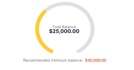
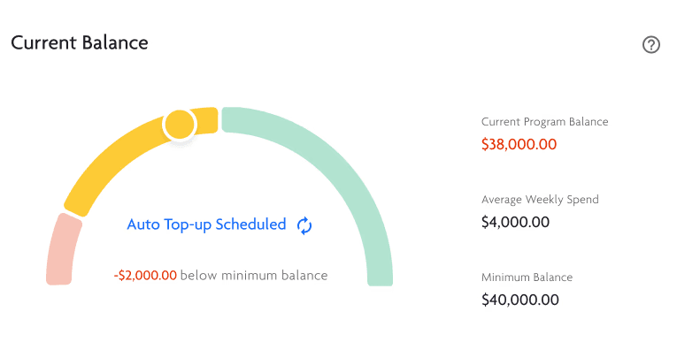
Instead of creating a comprehensive dashboard, create a visual lanugage that displays "statuses" for the Ribbon Issuing account, so users could quickly gauge when auto-transfers will be needed.
Instead of creating a comprehensive dashboard, create a visual lanugage that displays "statuses" for the Ribbon Issuing account, so users could quickly gauge when auto-transfers will be needed.
Instead of creating a comprehensive dashboard, create a visual lanugage that displays "statuses" for the Ribbon Issuing account, so users could quickly gauge when auto-transfers will be needed.





Methodology
Referred to other financial apps for inspiration, created numerous iterations, and tested with team members to see which visuals were most intuitive and helpful.
Referred to other financial apps for inspiration, created numerous iterations, and tested with team members to see which visuals were most intuitive and helpful.
Referred to other financial apps for inspiration, created numerous iterations, and tested with team members to see which visuals were most intuitive and helpful.
Rejected reason
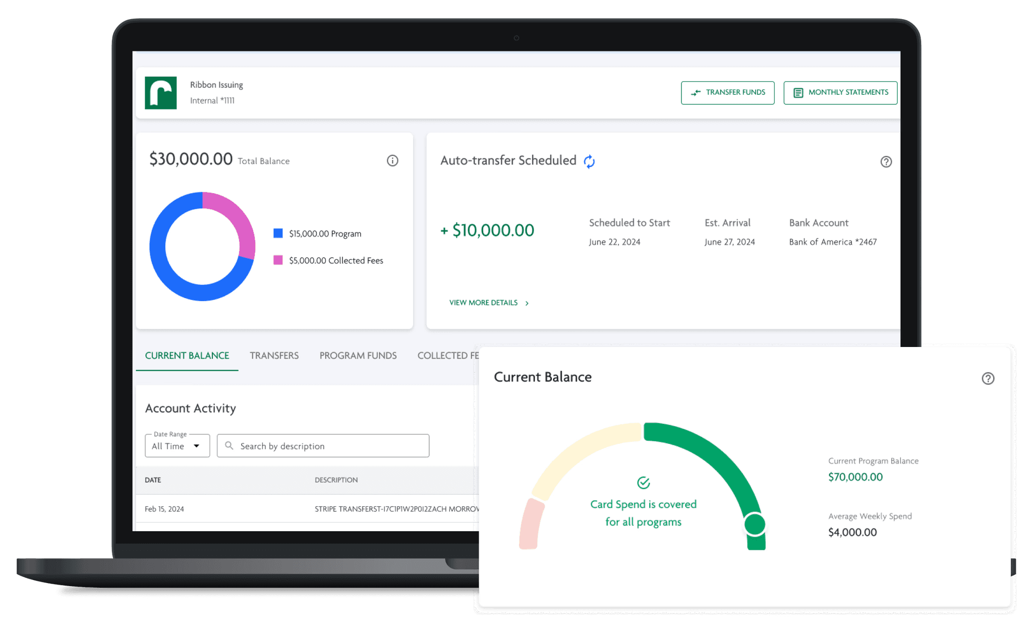
While the team was incredibly enthusiastic about this design, I worried that it may do more harm than good.
Firstly, because the intention was for Issuing to feel automatic, users weren't looking to track a status. This would have provided an unnecessary extra step for the user, rather than properly addressing their needs to have more control over their account.
Additionally, the logic of Ribbon Issuing was too complex to visualize in such a streamlined graphic. After presenting this idea to different team members, many had a different interpretation of what each color represents. Therefore, I created tooltips that explained the meaning of each status — however, this forced users to learn an otherwise unintuitive flow, that would inspire more questions than answers.
The average weekly spend and minimum balance data shown next to this gauge were not helpful to users. We initially assumed these metrics would be interesting, but feedback revealed they weren’t actionable or valuable enough. This design ended up adding unnecessary data to fill white space, which detracted from our core goal of reducing visual clutter and highlighting actionable, useful data for our sponsors.
With plans to refine the auto-transfer process in the future to lend itself to helpful visuals like these, we placed this design in the backlog, with the goal of receiving more user feedback on what additional data would be helpful.
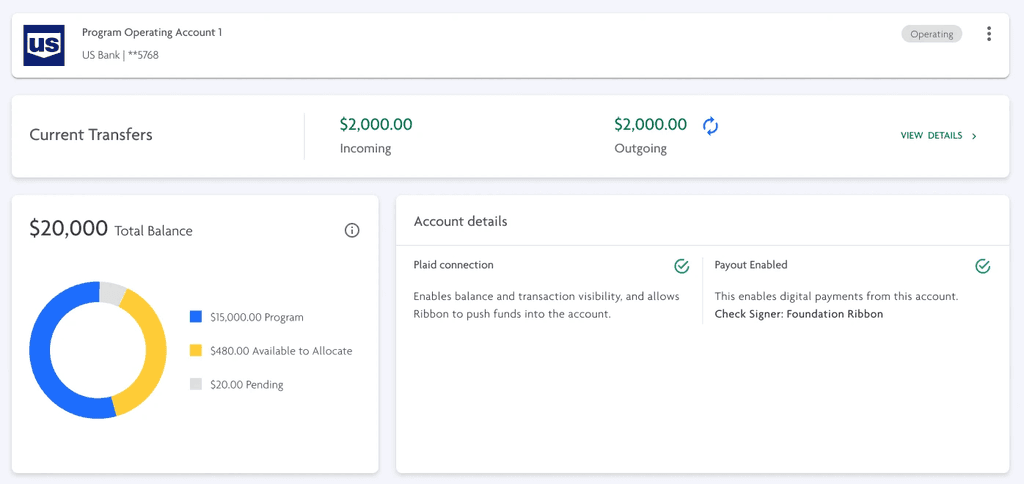
User testing revealed it was too similar to the Beta status banner on the Banking Overview page.
One user even praised the banner, mistaking it for the Beta notification, and then ran into the same allocation issue, proving the message was still being overlooked.
User testing revealed it was too similar to the Beta status banner on the Banking Overview page.
One user even praised the banner, mistaking it for the Beta notification, and then ran into the same allocation issue, proving the message was still being overlooked.
Display actionable, useful data to the user
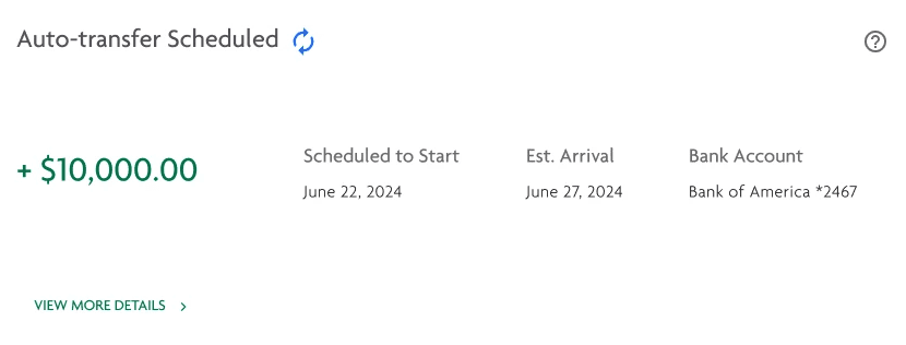




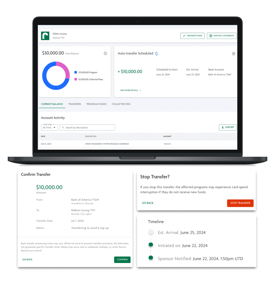
Clearly presenting information regarding upcoming auto-transfers.
We balanced user needs by prioritizing what they requested most: visibility into active and upcoming auto-transfers.
Previously, sponsors needed to opt-in for recommended auto-transfers via an email sent by our support staff, and we found that no sponsors have ever rejected the recommended transfer. Therefore, to remove an unnecessary step, we decided to automatically schedule transfers, while still allowing users the option to stop them if needed.
To ensure sponsors were aware of these transfers, we would display the above UI in their Issuing page, display the transfer information in their connected bank account page, display a banner upon login, and also send a system email with necessary information.
For some sponsors, this level of information was sufficient — they just wanted to see the total amount transferred, and from which bank account the funds were moving from, so they can adequately track such activity in their accounting processes.
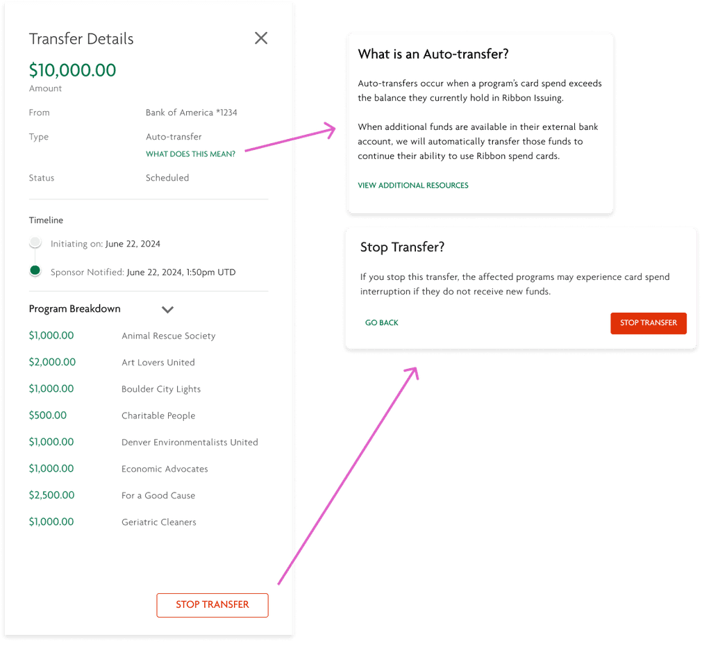


Ability to stop auto-transfers
To give sponsors time to stop a transfer without causing delays, we introduced a "Scheduled" state. Two days before a transfer is initiated, our system notifies the sponsor. During this period, they can stop the transfer or view details directly in our UI.
This flow allows sponsors to maintain control over their transfers, while also allowing them to reap the benefits of our automatic transfer process.
Some sponsors wanted to dive deeper into the details of our auto-transfers, so this expanded view allows sponsors to view a breakdown of how much each program will be receiving in this transfer. This view also allows them to track the status of the transfers — when they were notified, when it will or has initiated, and its estimated arrival date.
Many of my designs at Ribbon prioritized this flexibility in user needs — providing a high-level overview, while also allowing to dive deeper when needed.
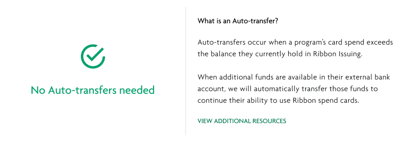


Designing for the happy-state to increase user awareness
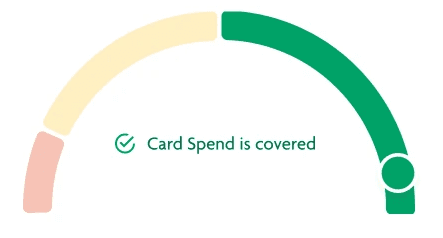
Since auto-transfers are an edge case, I also focused on designing for the majority use case where no transfers are needed. This visual aims to provide positive reassurance to our user — I wanted to promote confidence that everything is functioning smoothly and as expected.
Since auto-transfers are an edge case, I also focused on designing for the majority use case where no transfers are needed. This visual aims to provide positive reassurance to our user — I wanted to promote confidence that everything is functioning smoothly and as expected.
Since auto-transfers are an edge case, I also focused on designing for the majority use case where no transfers are needed. This visual aims to provide positive reassurance to our user — I wanted to promote confidence that everything is functioning smoothly and as expected.
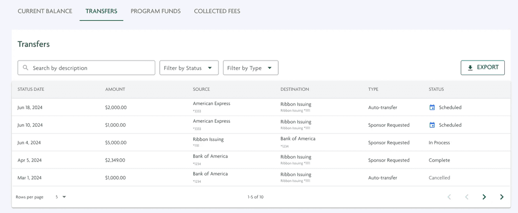


Ability to view auto-transfer history
Sponsors also needed a way to track the history of auto-transfers, to ensure accounting and financial compliance.
This table was designed to match the information they would receive on their external bank statements, and also aligned with accounting needs we identified through user testing.
Visual icons next to Scheduled transfers enable sponsors to quickly identify and adjust pending transfers, while filters streamline the viewing experience.
User need: Increase access to Issuing funds
Customers frequently expressed the desire to have direct access to their funds on Ribbon Issuing, similar to how they would for their external bank accounts — while users could easily log into their banking apps and request a funds transfer, Ribbon required users to submit an emailed transfer request to customer service.
Customers frequently expressed the desire to have direct access to their funds on Ribbon Issuing, similar to how they would for their external bank accounts — while users could easily log into their banking apps and request a funds transfer, Ribbon required users to submit an emailed transfer request to customer service.
Customers frequently expressed the desire to have direct access to their funds on Ribbon Issuing, similar to how they would for their external bank accounts — while users could easily log into their banking apps and request a funds transfer, Ribbon required users to submit an emailed transfer request to customer service.

Idea
Design a transfer process that matches a typical major bank's transfer flow.
Design a transfer process that matches a typical major bank's transfer flow.
Design a transfer process that matches a typical major bank's transfer flow.
Rejected reason
While we worked to borrow design patterns from major banks, such as American Express and CITI, Ribbon Issuing transfers differed due to the account's complex user structure. Therefore, it was essential to ensure that the bank transfer process allowed the user to accomplish their goals despite the complexity.
While we worked to borrow design patterns from major banks, such as American Express and CITI, Ribbon Issuing transfers differed due to the account's complex user structure. Therefore, it was essential to ensure that the bank transfer process allowed the user to accomplish their goals despite the complexity.
While we worked to borrow design patterns from major banks, such as American Express and CITI, Ribbon Issuing transfers differed due to the account's complex user structure. Therefore, it was essential to ensure that the bank transfer process allowed the user to accomplish their goals despite the complexity.
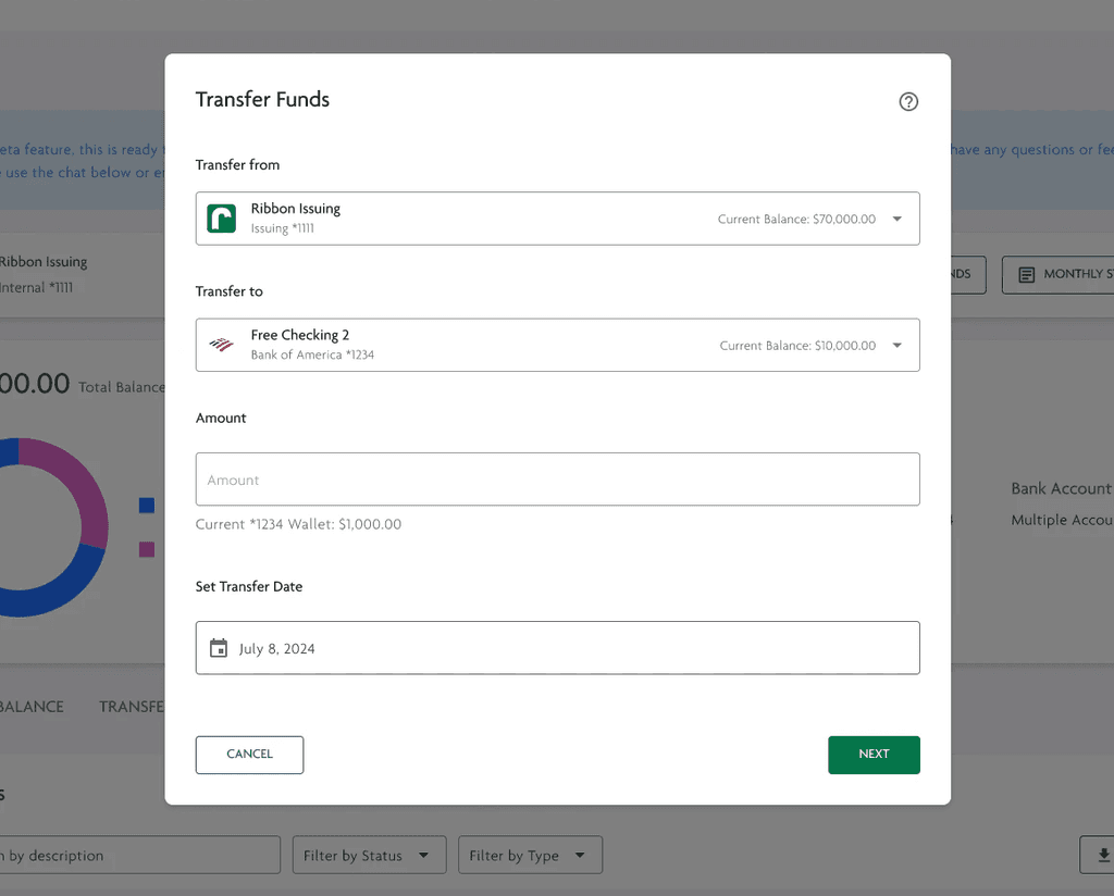
Allow users to seamlessly transfer funds in Ribbon
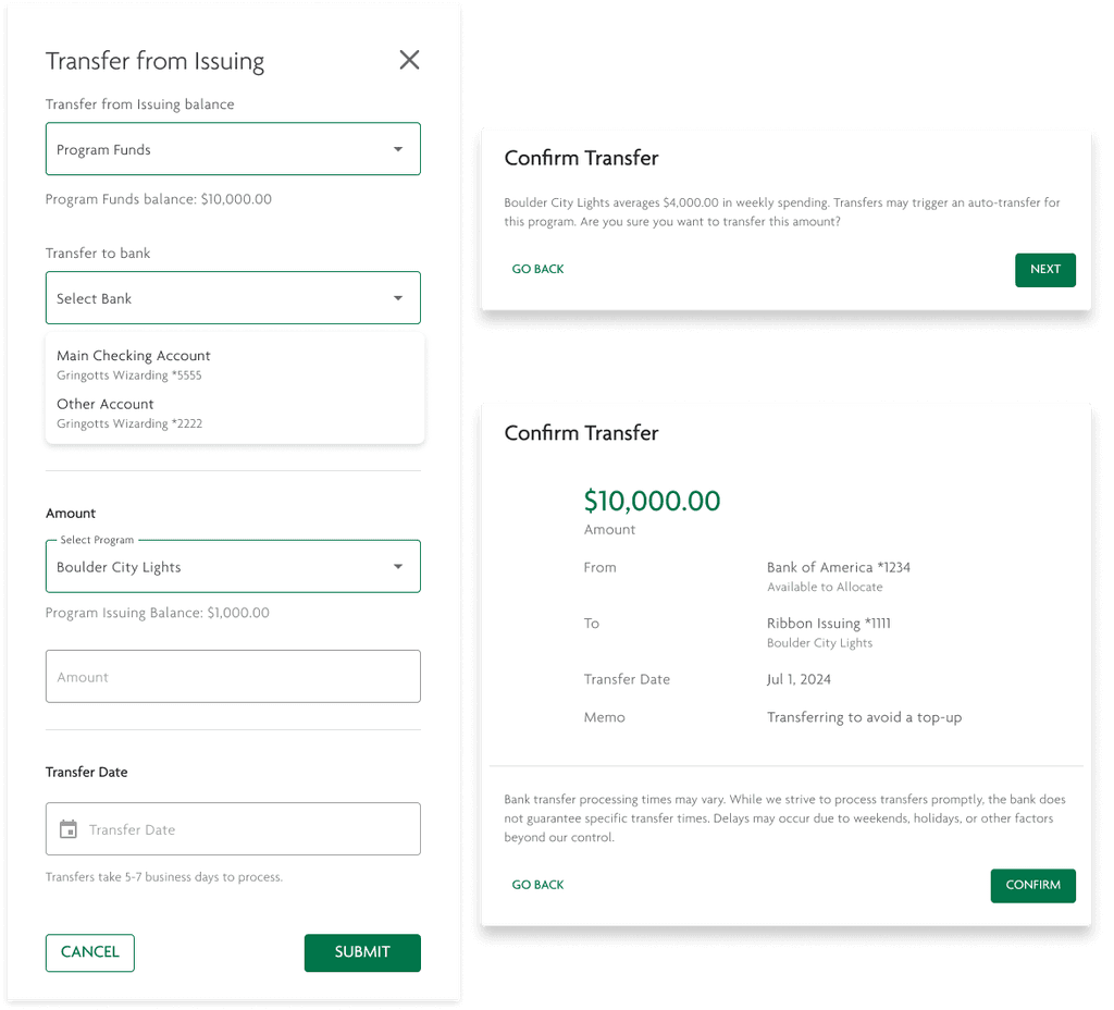


A streamlined and intuitive approach to an otherwise complex transfer process
Our new transfer process aligns with our design system, providing users with a familiar, intuitive flow for initiating bank transfers. This process was developed through extensive discussions on transfer logic, timing, and the ability to undo transfers.
This was beyond just designing UI — I was designing a completely new capability for our system that would move large quantities of bank funds.
The solution had to function intuitively, align with reporting and accounting standards, and be user-friendly, as errors could be costly. This required careful consideration beyond just the ideal scenario.
Users make mistakes, and when it pertains to their money, especially in the highly regulated world of nonprofits, I needed to ensure my designs were fool-proof and allowed the user to quickly identify and correct any mistakes.
User need: Make Issuing data easier to understand
As identified through user feedback and through my design audit, we found that the Ribbon Issuing showed a lot of information that was irrelevant to the user, and failed to display the information users were looking for.
As identified through user feedback and through my design audit, we found that the Ribbon Issuing showed a lot of information that was irrelevant to the user, and failed to display the information users were looking for.
As identified through user feedback and through my design audit, we found that the Ribbon Issuing showed a lot of information that was irrelevant to the user, and failed to display the information users were looking for.
Idea: Display all Issuing activity via Dashboards
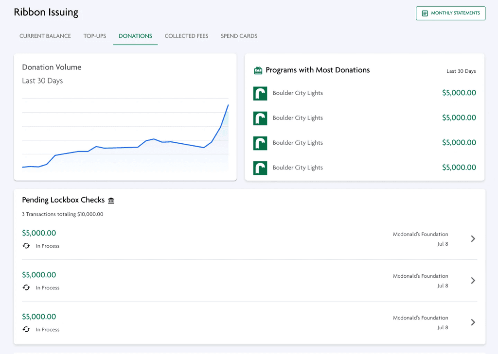




Display donation activity
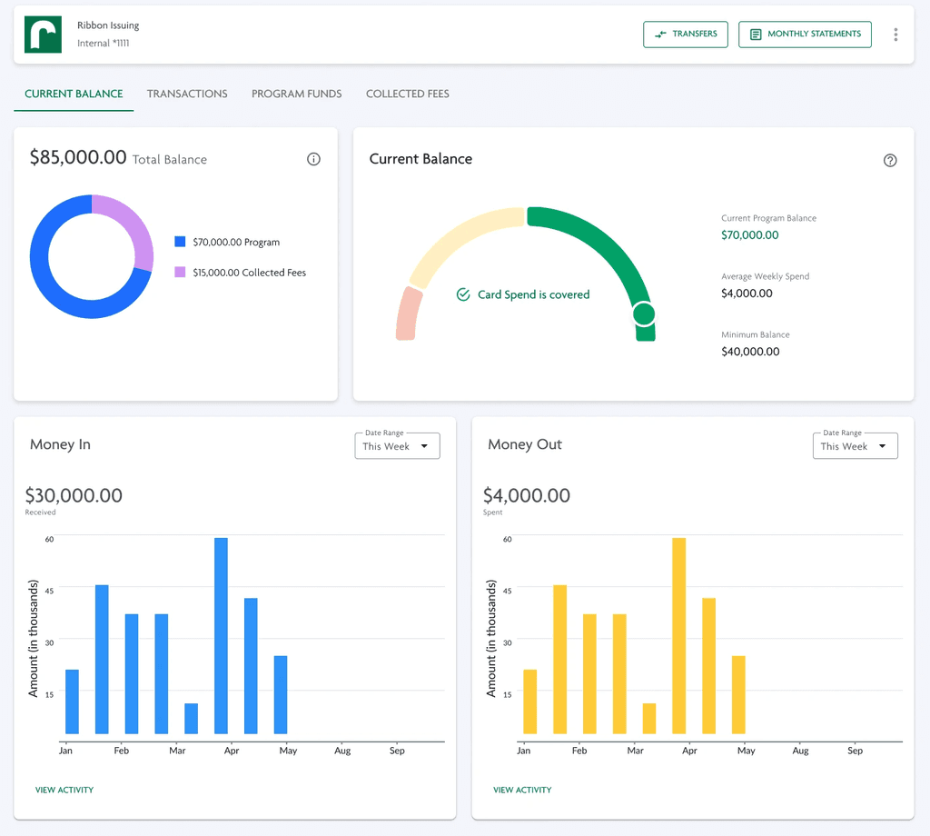
As Ribbon issuing is funded by donation activity, an idea was to add a dashboard that tracks donation volume and gives users a pulse on incoming funds. Another idea, similarly, was to give them a complete dashboard to give them an Birdseye view of money in and money out of issuing?
As Ribbon issuing is funded by donation activity, an idea was to add a dashboard that tracks donation volume and gives users a pulse on incoming funds. Another idea, similarly, was to give them a complete dashboard to give them an Birdseye view of money in and money out of issuing?
As Ribbon issuing is funded by donation activity, an idea was to add a dashboard that tracks donation volume and gives users a pulse on incoming funds. Another idea, similarly, was to give them a complete dashboard to give them an Birdseye view of money in and money out of issuing?
Rejected reason
I worried that we would overwhelm the user with data that we thought they’d want, but didn’t actually need.
Research showed that there were a lot of unknowns for what users needed regarding Issuing data, but what we did know is that the ifnrmation we currently show them could be clarified. We chose to focus on improving what we knew rather than expanding the project scope based on unproven hypotheses.
Optimize Ribbon Issuing UI, removing unnecessary clutter
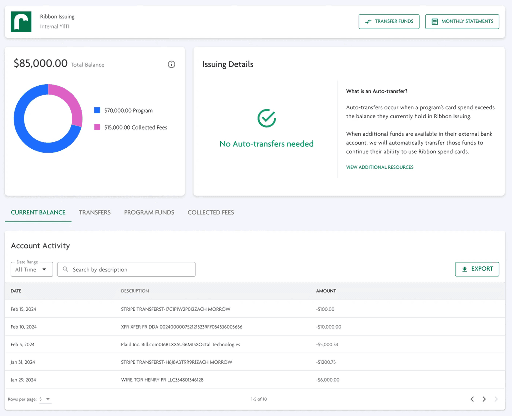


Declutter the Issuing Page, and add points of value
Removed data points that were unhelpful and inconsistent with Ribbon Issuing's functionality by:
Cleaning up the Descriptions for transactions, showing them in a more user-friendly way
Removed tables that were not relevant to Ribbon Issuing, such as Allocation Activity
Aligned reporting more closely with what they would need for accounting, such as quick links to Monthly Statements
Final Solution
Final Solution
Final Solution
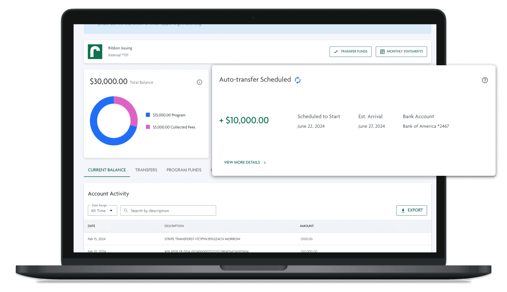


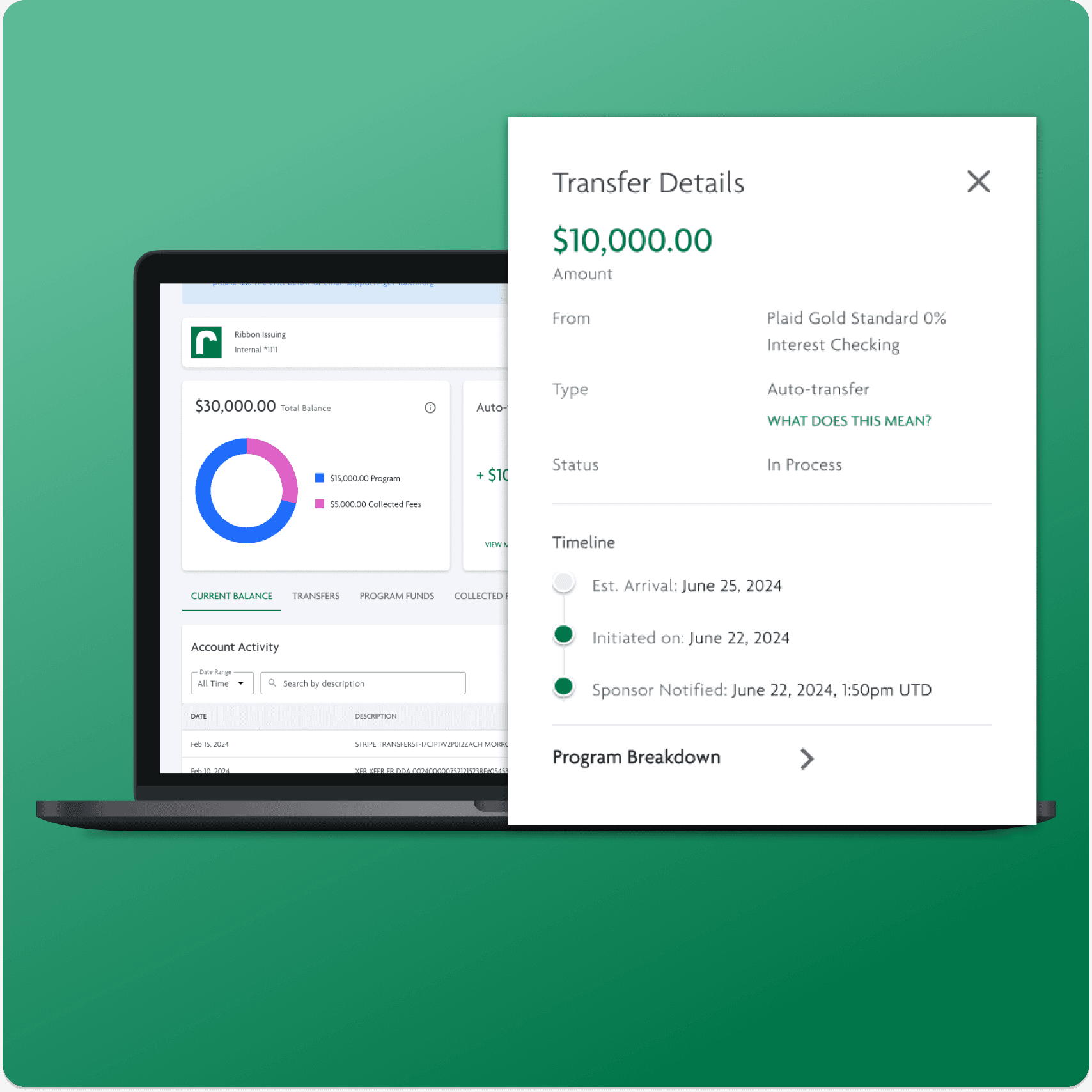


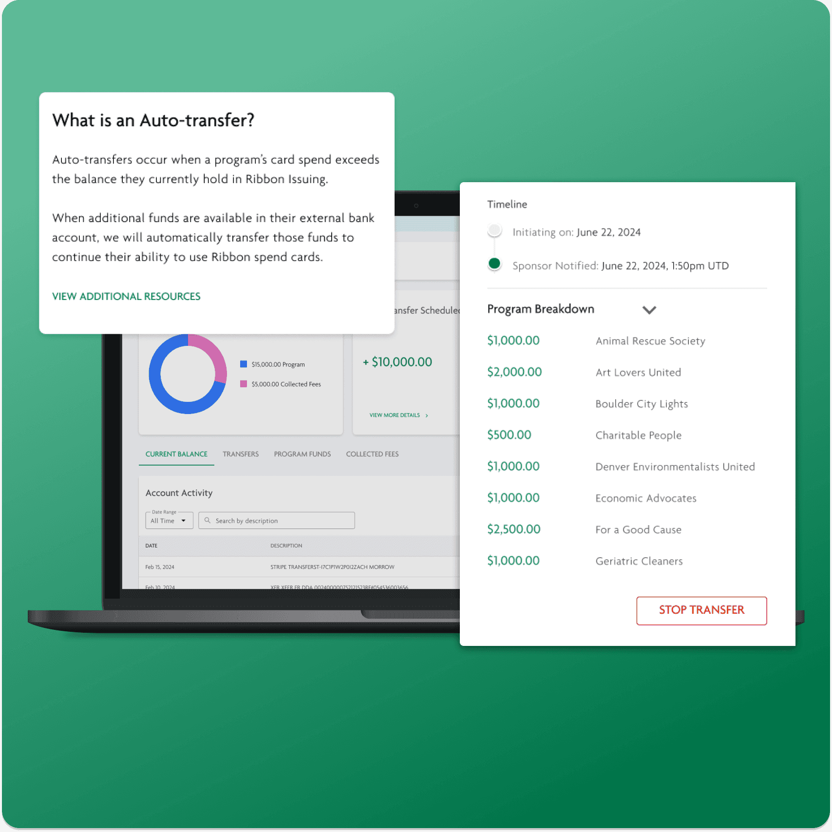


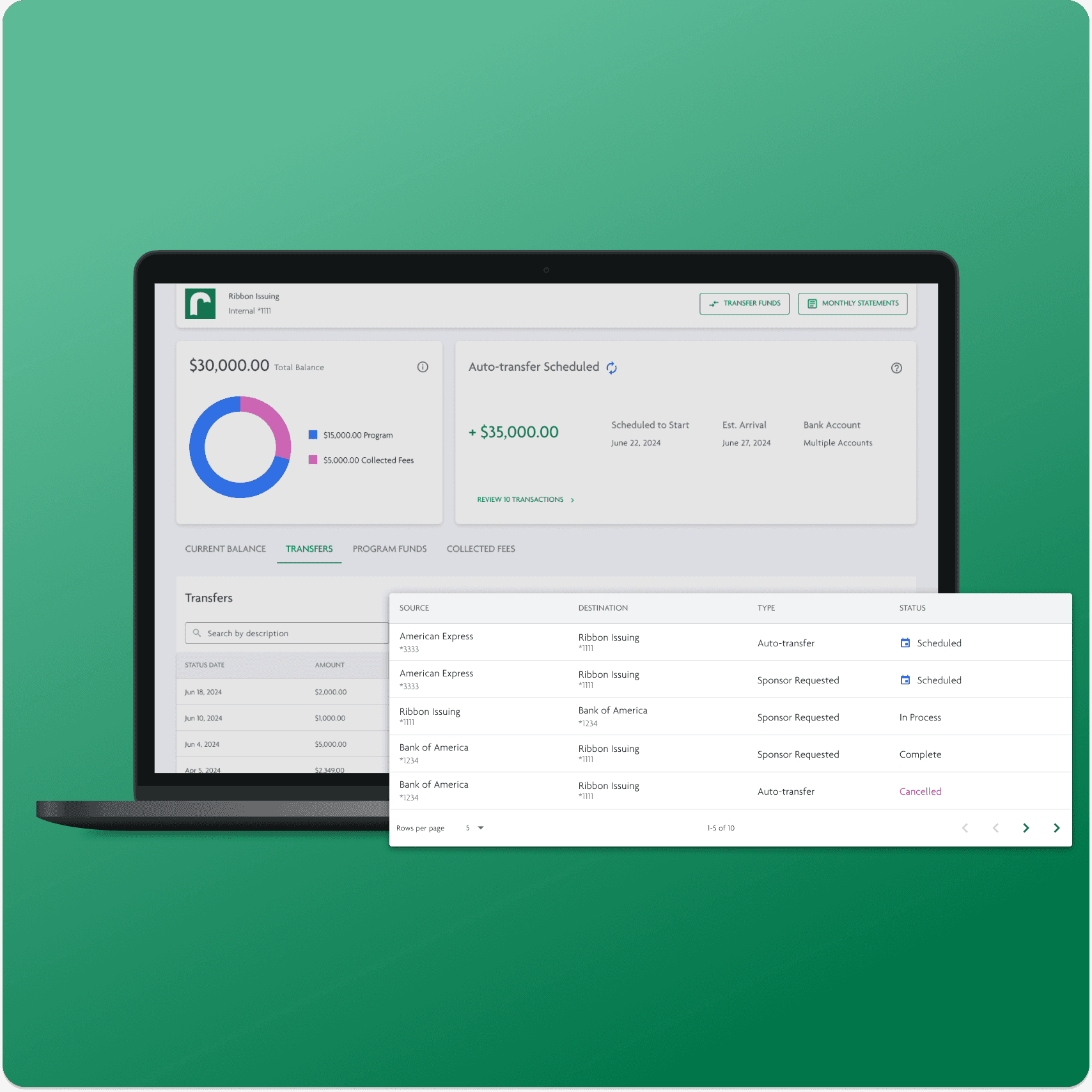


Top-Up Visibility: Sponsors were informed of upcoming transfers with clear UI prompts, including details on which account the funds were coming from, the amount, and the reason for the transfer.
Fund Access: A new manual transfer process was introduced, allowing sponsors to move money in and out of Ribbon Issuing as needed, mirroring the functionality of external bank accounts.
Streamlined Information: Irrelevant tables and data were removed, focusing on what truly mattered to sponsors, such as monthly statements and transfer details.
Key Takeaways
Design for user needs, not product nice to haves
Design for user needs, not product nice-to-haves
Our team understood the system logic better than our users, leading us to assume user needs that didn’t align with their actual preferences. I focused on basing our decisions on validated user problems, rather than our assumptions.
Our team understood the system logic better than our users, leading us to assume user needs that didn’t align with their actual preferences. I focused on basing our decisions on validated user problems, rather than our assumptions.
Our team understood the system logic better than our users, leading us to assume user needs that didn’t align with their actual preferences. I focused on basing our decisions on validated user problems, rather than our assumptions.
Data must be actionable and valuable — showing unncessary data overwhelms the user
Data needed to be presented in a way that offered both high-level insights and detailed information as needed. By highlighting key data and avoiding an overload of information, users can focus on their tasks without spending extra time sorting through irrelevant data.
Data needed to be presented in a way that offered both high-level insights and detailed information as needed. By highlighting key data and avoiding an overload of information, users can focus on their tasks without spending extra time sorting through irrelevant data.
Data needed to be presented in a way that offered both high-level insights and detailed information as needed. By highlighting key data and avoiding an overload of information, users can focus on their tasks without spending extra time sorting through irrelevant data.
Automation requires control
Users expect modern technology to automate stressful tasks and simplify their workflows. Therefore, it was crucial to design for automation, with future plans to use AI for further streamlining. A key aspect of automation, however, is control — especially in the world of fintech and nonprofits, users still needed to maintain control over all processes.
Users expect modern technology to automate stressful tasks and simplify their workflows. Therefore, it was crucial to design for automation, with future plans to use AI for further streamlining. A key aspect of automation, however, is control — especially in the world of fintech and nonprofits, users still needed to maintain control over all processes.
Users expect modern technology to automate stressful tasks and simplify their workflows. Therefore, it was crucial to design for automation, with future plans to use AI for further streamlining. A key aspect of automation, however, is control — especially in the world of fintech and nonprofits, users still needed to maintain control over all processes.
Let's Chat!
Looking for UX, UI, or strategic support for your startup, small business, or independent project? I am always happy to chat and help elevate your user and product experience!
Let's Chat!
Looking for UX, UI, or strategic support for your startup, small business, or independent project? I am always happy to chat and help elevate your user and product experience!
Designed by Kiana Cozier, 2024
Designed by Kiana Cozier, 2024

