Enhancing Financial Clarity for Nonprofits on Ribbon
Redesigning a critical banking workflow to boost user confidence and efficiency.
Skills Demonstrated: Interaction Design, Usability Testing, User Research, UI Design, Product Strategy, UX Design

About Ribbon
About Ribbon
About Ribbon
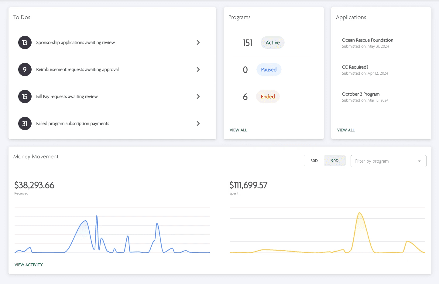
Ribbon is a specialized banking and operational platform designed for fiscal sponsors—nonprofits that extend their tax-exempt status to smaller programs.
Ribbon enables these sponsors to manage multiple programs on a single platform, while also providing each program with a personalized view of their finances and operations.


Project Overview
Industry
Industry
Fintech
Timeline
Timeline
1 month
Team
Team
Product Designer (myself)
Head of Product
Engineering Team
Allocations are a critical feature of Ribbon's platform, allowing sponsors to assign funds from their bank accounts to specific programs, enabling programs to see accurate balances on their dashboards, and ensuring sponsors' financial tracking remains compliant and accurate,
80% of our system's deposits were allocations, and it accounted for 80% of our variable revenue. In other words, Allocations are the backbone of Sponsor Banking on Ribbon.
While an essential process of our platform, it was also a major source of pain for our customers.
Users often struggled to understand how much money they could allocate to programs, and the amount available was frequently less than they anticipated or needed, leading to errors. This discrepancy wasn't clear until after they attempted the allocation, leaving them confused about why it happened.
These issues, which often appeared as system glitches, caused a surge in customer support inquiries, draining resources and undermining trust.
I was tasked with investigating the issues at hand and implementing a design solution.
A critical feature of Ribbon is the Allocations process, which allows sponsors to assign funds from their bank accounts to specific programs, enables programs to see accurate balances on their dashboards, and ensure sponsors' financial tracking remains compliant and accurate, 80% of our system's deposits were allocations, and it accounted for 80% of our variable revenue. In other words, Allocations are the backbone of Sponsor Banking on Ribbon. While an essential process of our platform, it was also a main source of pain for our customers. Users often struggled to understand how much money they could allocate to programs, and the amount available was frequently less than they anticipated or needed, leading to errors. This discrepancy wasn't clear until after they attempted the allocation, leaving them confused about why it happened. These issues, which often appeared as system glitches, caused a surge in customer support inquiries, draining resources and undermining trust. I was tasked with investigating this issues at hand and implementing a design solution.
Problem
Users often misunderstood how much money they had available to allocate to programs, leading to unexpected shortfalls, frequent support inquiries, and diminished trust in the platform.
Users often misunderstood how much money they had available to allocate to programs, leading to unexpected shortfalls, frequent support inquiries, and diminished trust in the platform.
Solution
I redesigned the Allocations process to improve clarity, streamline user experience, and reduce errors. This included clearer messaging, better validation, and user-tested iterations.
I redesigned the Allocations process to improve clarity, streamline user experience, and reduce errors. This included clearer messaging, better validation, and user-tested iterations.
Results
Results
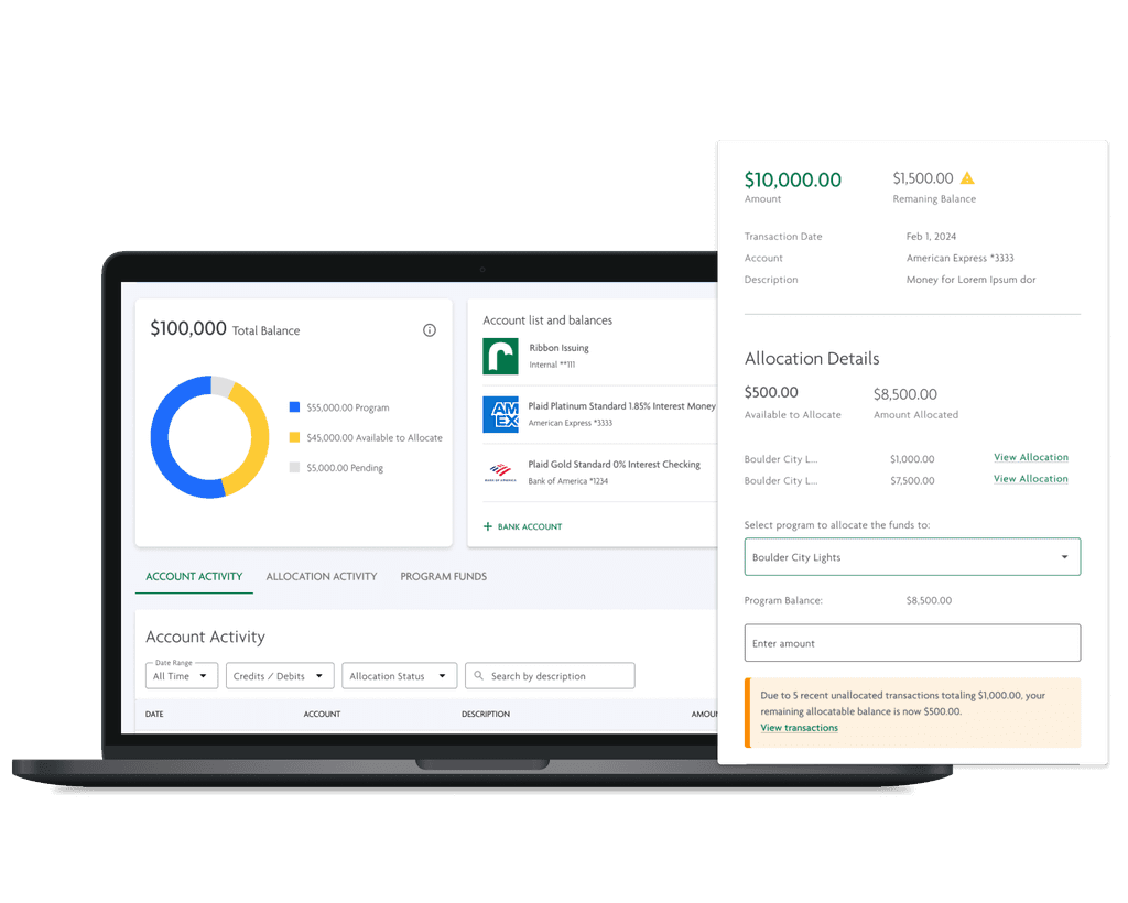

25% reduction in customer support inquiries related to allocations.
15% improvement in task completion time for allocations.
50% decrease in user-reported allocation errors.
User Research
User Research
Strategy
To gain a deep understanding of the problem, I sought to uncover the "who, what, why, and when" of the issue: when and why it occurred, what customers were saying, and how it impacted them.
To gain a deep understanding of the problem, I sought to uncover the "who, what, why, and when" of the issue: when and why it occurred, what customers were saying, and how it impacted them.
To gain a deep understanding of the problem, I sought to uncover the "who, what, why, and when" of the issue: when and why it occurred, what customers were saying, and how it impacted them.
Methodology
Conducted thorough interviews with key team members.
Shadowed Customer Support inbox to track frequency and content of allocation-related complaints
Hosted feedback calls with a diverse set of customers
Met frequently with customers to present and test ideas throughout design process.
Conducted thorough interviews with key team members.
Shadowed Customer Support inbox to track frequency and content of allocation-related complaints
Hosted feedback calls with a diverse set of customers
Met frequently with customers to present and text ideas throughout design process.
Conducted thorough interviews with key team members.
Shadowed Customer Support inbox to track frequency and content of allocation-related complaints
Hosted feedback calls with a diverse set of customers
Met frequently with customers to present and text ideas throughout design process.
Results
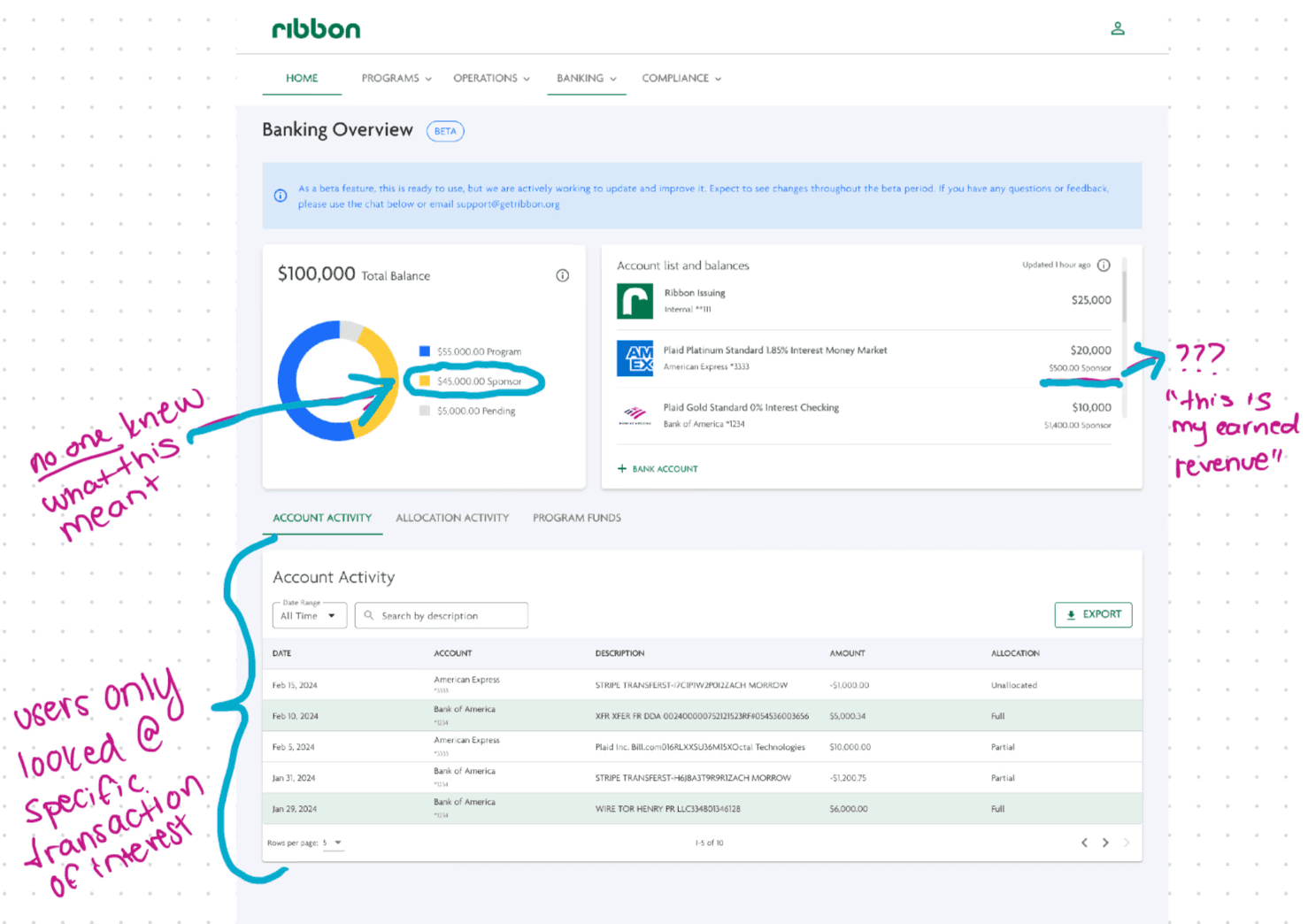
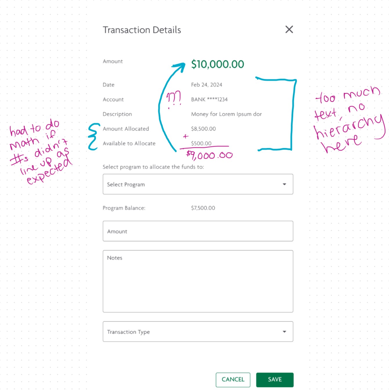
Identified core user patterns that could influence why our current design was ineffective, and established design priorities to improve the particular pitfalls.
Also identified the core cause of this issue — transactions that were mistakenly never allocated by sponsors lead to users unknowingly lowering their Available to Allocate balance, instead of correctly deducting expenses from their programs.


Design Process
Design Process
Jumping straight into high-fidelity designs due to our time constraints, I worked to quickly make as many ideas as possible. I was initially aiming for quantity over quality, with the goal of cancelling out the obvious No's and focusing on refining the viable opportunities.
All designs leveraged Ribbon's design system, and any new components were properly organized and integrated into the design system.
Challenge
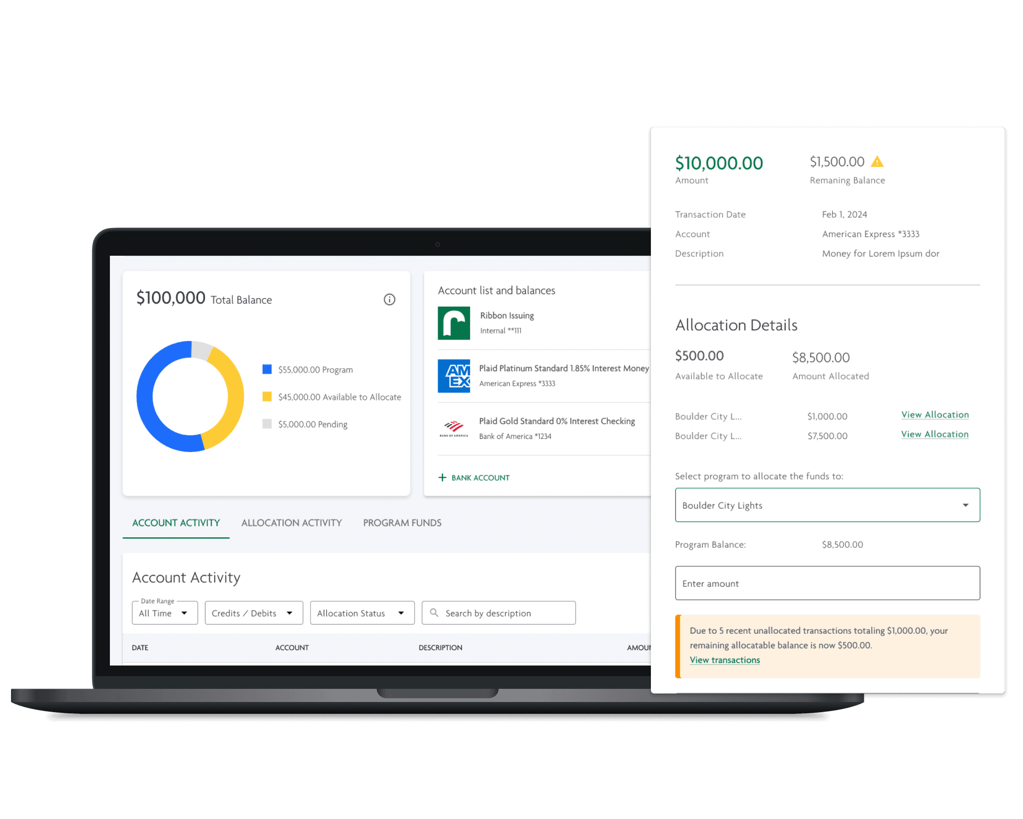
How can we alert users about allocation limitations before they reach the end of the process?
Challenge
How can we alert users about allocation limitations before they reach the end of the process?


Idea
Add a red "error" banner on applicable transactions that could not be fully allocated.
Add a red "error" banner on applicable transactions that could not be fully allocated.
Add a red "error" banner on applicable transactions that could not be fully allocated.
Rejected reason
This proved to be too jarring to our users and provided a sense of panic. In other words, red was too intense.
This proved to be too jarring to our users and provided a sense of panic. In other words, red was too intense.
This proved to be too jarring to our users and provided a sense of panic. In other words, red was too intense.
Idea
Switch the banner to blue, aligning with our design system’s friendly notification style.
Switch the banner to blue, aligning with our design system’s friendly notification style.
Switch the banner to blue, aligning with our design system’s friendly notification style.
Rejected reason
User testing revealed it was too similar to a Beta status banner on the another banking page.
One user even praised the banner, mistaking it for the Beta notification, and then ran into the same allocation issue, proving the message was still being overlooked.
User testing revealed it was too similar to the Beta status banner on the Banking Overview page.
One user even praised the banner, mistaking it for the Beta notification, and then ran into the same allocation issue, proving the message was still being overlooked.
User testing revealed it was too similar to the Beta status banner on the Banking Overview page.
One user even praised the banner, mistaking it for the Beta notification, and then ran into the same allocation issue, proving the message was still being overlooked.


Final Design
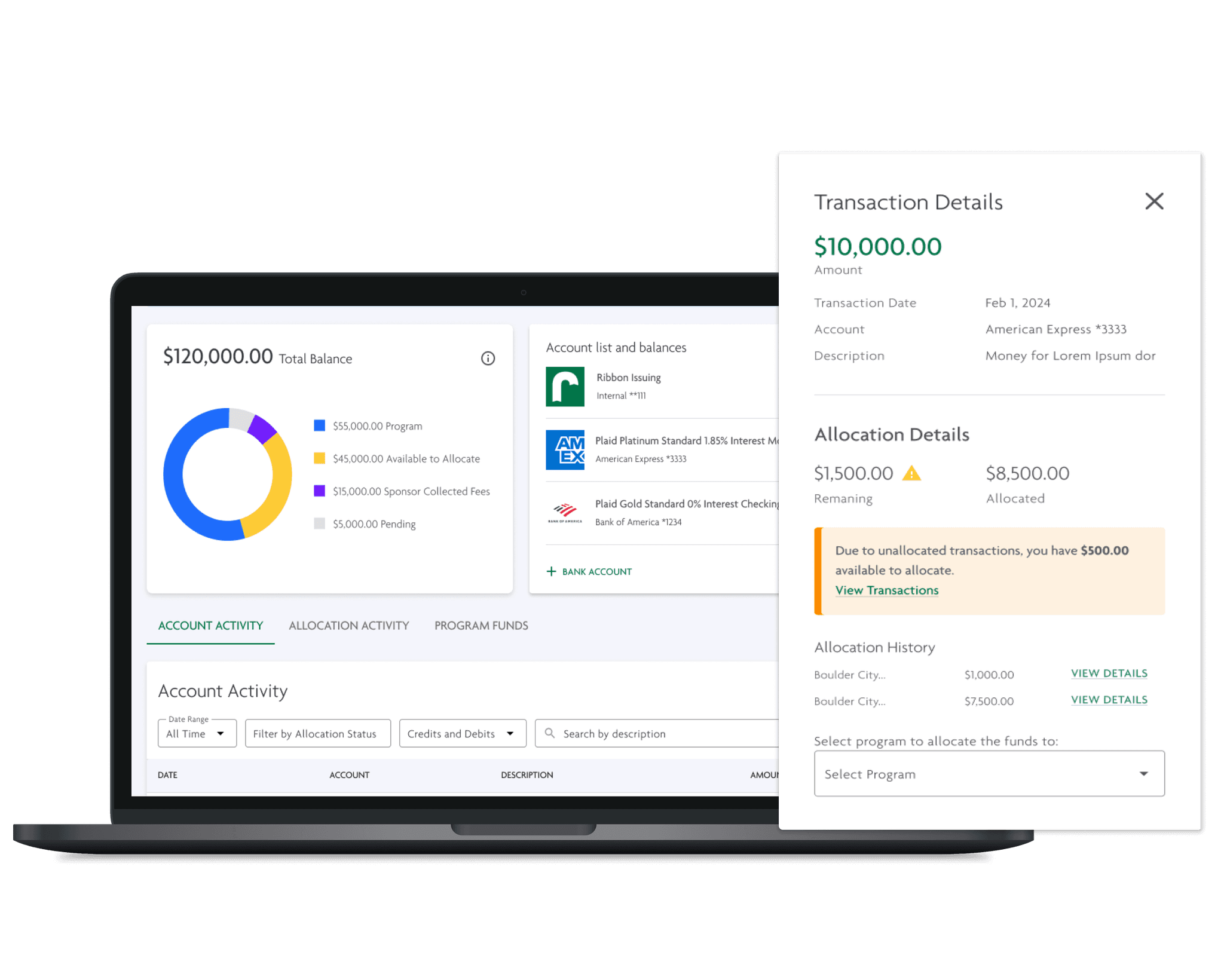
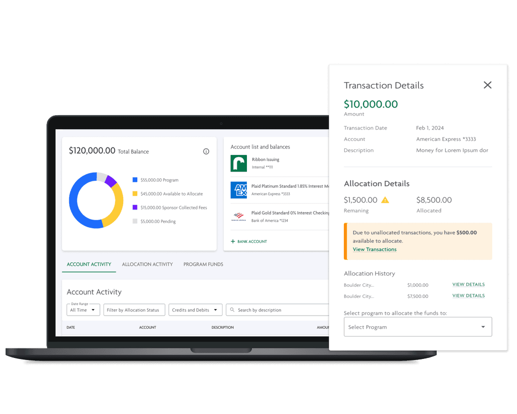
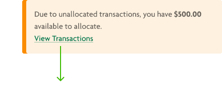
An orange Warning state for the banner, which grabs user attention without being too intrusive.
This design allows users to disregard the message if they're already aware of allocation limits but ensures they can adjust their expectations before entering incorrect amounts.
I also updated the original Warning banner, which had yellow text on a yellow background, to meet WCAG color contrast standards.
Challenge
How can we help the user resolve this problem themselves?
Challenge
How can we help the user resolve this problem themselves?
A primary goal was to not only alert the user, but to also guide them towards corrective action.
Many users would immediately reach out to our Customer Support for help in identifying the problem, which utilized a lot of company resources, and also greatly slowed down the user's actions.
A primary goal was to not only alert the user, but to also guide them towards corrective action.
Many users would immediately reach out to our Customer Support for help in identifying the problem, which utilized a lot of company resources, and also greatly slowed down the user's actions.
A primary goal was to not only alert the user, but to also guide them towards corrective action.
Many users would immediately reach out to our Customer Support for help in identifying the problem, which utilized a lot of company resources, and also greatly slowed down the user's actions.


Idea
Show the user transactions that are unallocated and allow them to allocate directly in the drawer.
Show the user transactions that are unallocated and allow them to allocate directly in the drawer.
Show the user transactions that are unallocated and allow them to allocate directly in the drawer.
Rejected reason
Not scalable and would not lend well to 5+ transactions, which would be the typical use case.
Not scalable and would not lend well to 5+ transactions, which would be the typical use case.
Not scalable and would not lend well to 5+ transactions, which would be the typical use case.


Idea
Display a warning, or a list of unallocated transactions, when entering the main page.
Rejected reasons
Since we couldn't predict which transactions the user intended to allocate, this could cause unnecessary distraction or panic over an issue that might not affect their flow.
Additionally, user testing revealed that users often ignored content on the Banking Overview page, focusing solely on their task.
Alternative
Display banners only on transactions that couldn't be fully allocated, ensuring the message reached them at the most relevant moment.
Display banners only on transactions that couldn't be fully allocated, ensuring the message reached them at the most relevant moment.
Display banners only on transactions that couldn't be fully allocated, ensuring the message reached them at the most relevant moment.


Final Design
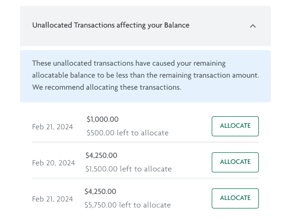
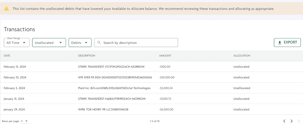
A new filtered view on our Transactions table to display potentially unallocated transactions more clearly.
The updated banner includes a call to action that directs users to these specific transactions, helping them understand allocation issues and resolve them independently.
We added new filters to this table to allow the user to easily view these transactions whenever necessary, to avoid creating a valuable flow that can only be accessed through an occassional and situational warning banner.
Challenge
How can we make the transactions drawer more valuable overall?
Challenge
How can we make the transactions drawer more valuable overall?
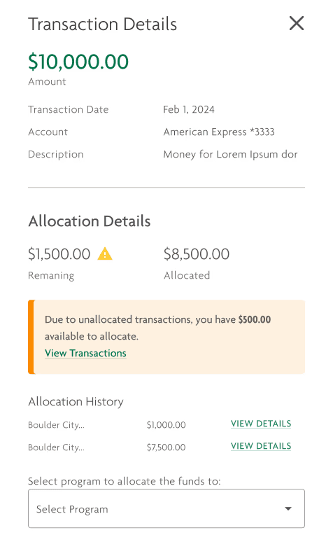
User testing revealed that most users ignored the text in the Transaction drawer due to poor information hierarchy.
User testing revealed that most users ignored the text in the Transaction drawer due to poor information hierarchy.
User testing revealed that most users ignored the text in the Transaction drawer due to poor information hierarchy.


Final Design
Created an Allocation Details section, enabling users to quickly view the information that is most important within their allocations process.
I interviewed and presented concepts to users to ensure that this information aligned with what the user would be looking for, while also alerting them that their expectation cannot be completed.
I also created an Allocation History section, to allow users to now easily navigate between transactions and their allocations.
Challenge
How can we improve the terminology to make sense to the user?
Challenge
How can we improve the terminology to make sense to the user?
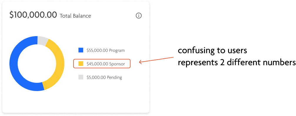


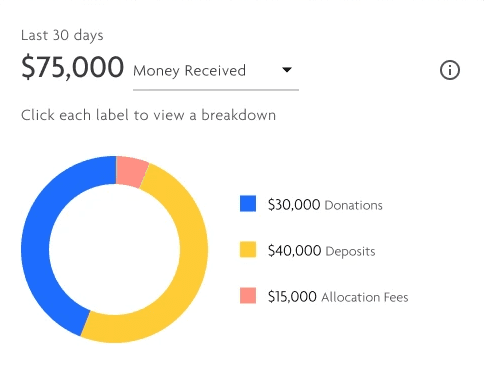
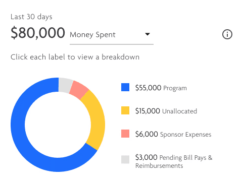
I immediately knew we needed to improve user understanding of key terms. Through user feedback, we quickly found that the term "Sponsor" was incredibly ambiguous — many of our users believed this represented their earned fee revenue, rather than the amount that they can allocate to programs.
Idea
Specify the terms within the donut chart on the Banking page, to one of the following terms
Sponsor Revenue: "revenue" was off-putting to our customers; as such a term is not consistent to the nonprofit landscape.
Unallocated: Implied missing action, which didn't match the system's function.
Unallocated Funds: Had the same issue as "Unallocated" and was more wordy.
Allocatable Funds: Preferred option, but noticed in user testing that it was difficult to say — the phrasing was unintuitive.
Specify the terms within the donut chart on the Banking page, to one of the following terms
Sponsor Revenue: "revenue" was off-putting to our customers; as such as term is not consistent to the nonprofit landscape
Unallocated: Implied missing action, which didn't match the system's function.
Unallocated Funds: Had the same issue as "Unallocated" and was more wordy.
Allocatable Funds: Preferred option, but noticed in user testing that it was difficult to say — the phrasing was unintuitive
Rejected reason
This added complexity confused users, as they weren't looking for such detailed breakdowns.
User testing revealed that the chart's main value was providing sponsors with a quick gauge of how much they could allocate. Therefore, it was crucial to align the labels with their expectations for clarity and precision.


Final Design
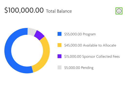
User Testing proved that while simple, changing the labels to Program, Sponsor Collected Fees, and Available to Allocate led to newfound understanding and established an intutive experience for the users.
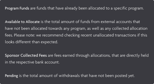
I also added a tooltip to this donut chart, to ensure that our users could see the Ribbon-verified definition of each term. While tooltips are not my preferred manner to convey information, it was a step towards ensuring that our users were properly educated on our product.
User Testing proved that while simple, changing the labels to Program, Sponsor Collected Fees, and Available to Allocate led to newfound understanding and established an intutive experience for the users.
I also added a tooltip to this donut chart, to ensure that our users could see the Ribbon-verified definition of each term. While tooltips are not the preferred manner to convey information, it was a step towards ensuring that our users were properly educated on our product.
Final Solution
Final Solution
Final Solution


We knew the solution was ready when we presented it to customers and saw that it resonated with them. Not only were they able to successfully complete allocations, but they also gained a much deeper understanding of the entire process.
In fact, they were able to clearly explain the problem back to me, demonstrating their increased confidence in the system. Users reported increased confidence in handling allocations, and the feature became a positive highlight rather than a frequent topic of concern.
Most notably, there was a significant reduction in customer support inquiries related to allocation issues, indicating that the solution effectively addressed the core problems and improved overall user satisfaction.
Key Takeaways
Importance of User Testing
Importance of User Testing
Importance of User Testing
Direct user testing was especially essential in this project, as our users had different associations and behaviors than our internal team. The final product was heavily determined from user feedback, which resulted in a more successful and user-centered solution.
Guiding over Telling
Guiding over Telling
Guiding over Telling
Providing guidance through design is more impactful than merely presenting information. It’s important to lead users towards the correct actions rather than just stating facts.
Balancing Simplicity & Impact
Balancing Simplicity & Impact
Balancing Simplicity & Impact
While simple designs can have a significant impact, excessive simplicity may render important elements too subtle for users to notice. Striking the right balance is key.
Breaking Habit Behavior
Breaking Habit Behavior
Breaking Habit Behavior
Introducing distinct design elements helps users break habitual behaviors and become more attentive to new features and changes.
Let's Chat!
Looking for UX, UI, or strategic support for your startup, small business, or independent project? I am always happy to chat and help elevate your user and product experience!
Let's Chat!
Looking for UX, UI, or strategic support for your startup, small business, or independent project? I am always happy to chat and help elevate your user and product experience!
Designed by Kiana Cozier, 2024
Designed by Kiana Cozier, 2024

