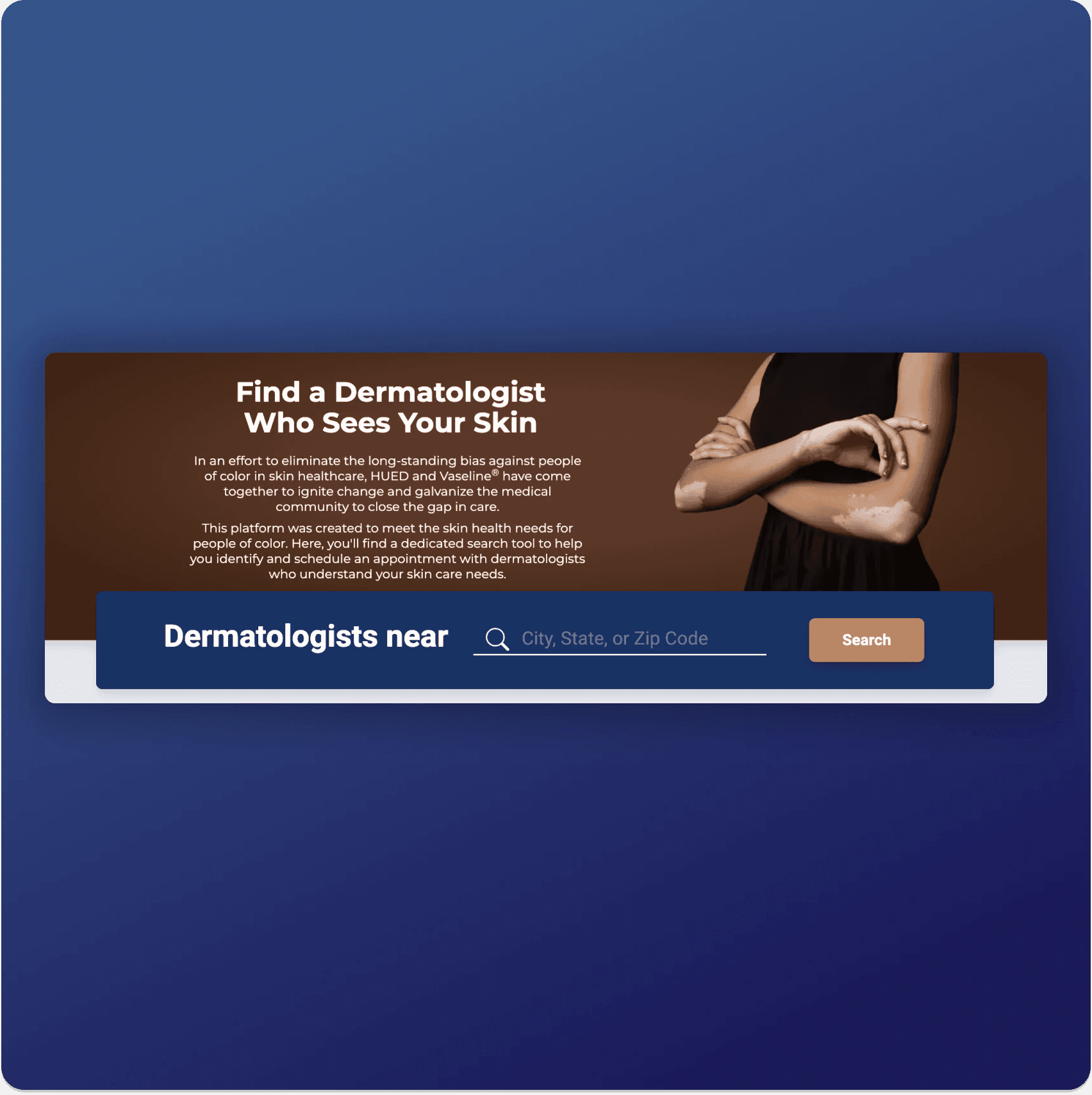
Dermatologist Directory
Increasing access to culturally humble dermatologists, created in partnership with HUED and Vaseline.
Skills Demonstrated: Interaction Design, Usability Testing, User Research, UI Design, Product Strategy, Project Management
Project Overview
Home Services
1 month
Myself as project lead and UX Designer; VP of Engineering, Head of Product, Director of Customer Success, Edelman (Vaseline's representative agency)
Problem
Only 7% of doctor profiles contained the necessary information to successfully book appointments with patients. Due to an inefficient booking process, only 10% of booked appointments were successfully fulfilled.
Solution
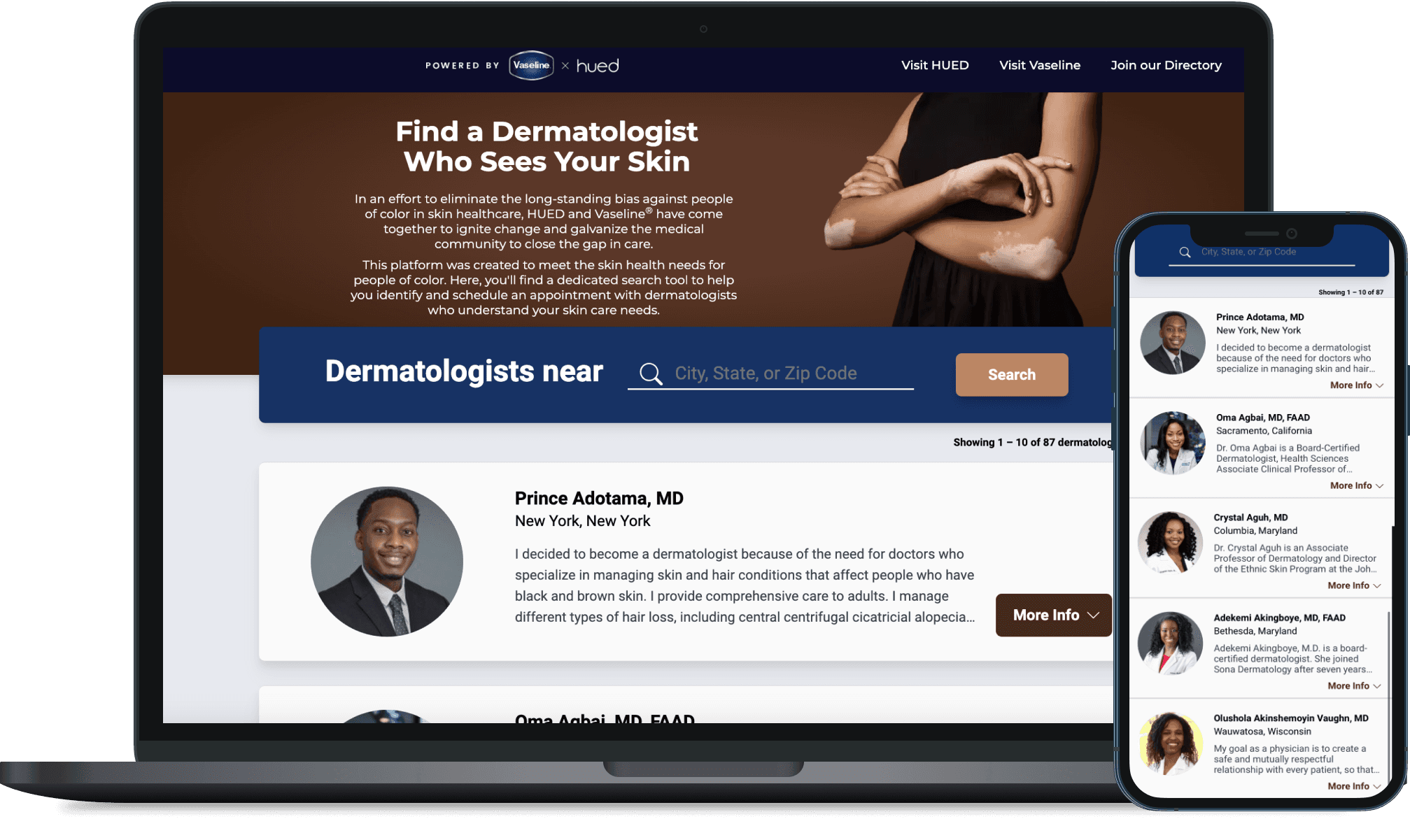
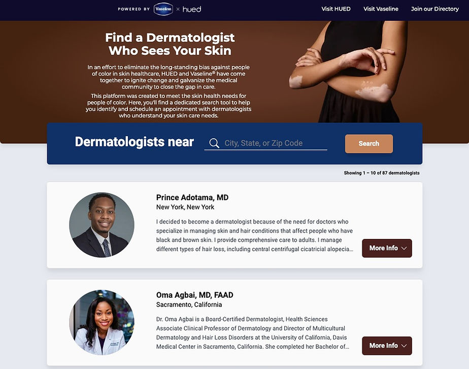
Create a more simplified directory, outside of the Wordpress plugin, to enhance the user experience, increase engagement with the platform, and more effectively promote HUED and Vaseline's shared mission.
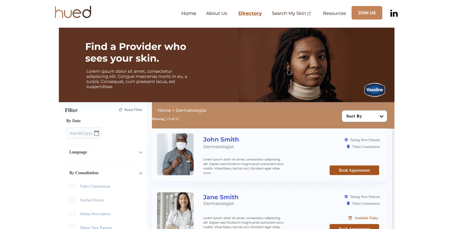
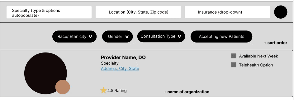
The former directory had a rigid UI, limiting the ability to market additional campaigns, and displaying many search filters that would not render any results.
User Research
To identify a viable solution, I conducted rapid user research with my team members, friends and family. I asked them to find a doctor on our current platform, observing pain points and common behaviors. I also interviewed them about their experience finding doctors, how they decide which to book appointments with, and what qualities are most important in their search. Additionally, I met with doctors to learn more about their experience with online booking platforms.
With multiple user interviews, surveys, and competitive research, my research allowed me to identify the following needs:
Doctors
Need the online booking to be as seamless as possible, requiring minimal maintenance while also having the opportunity to provide critical information about their practice.
Patients
Need enough information to feel trust and safety with potential doctors. Priorities are doctor's location, insurance availability, and information about their practice.
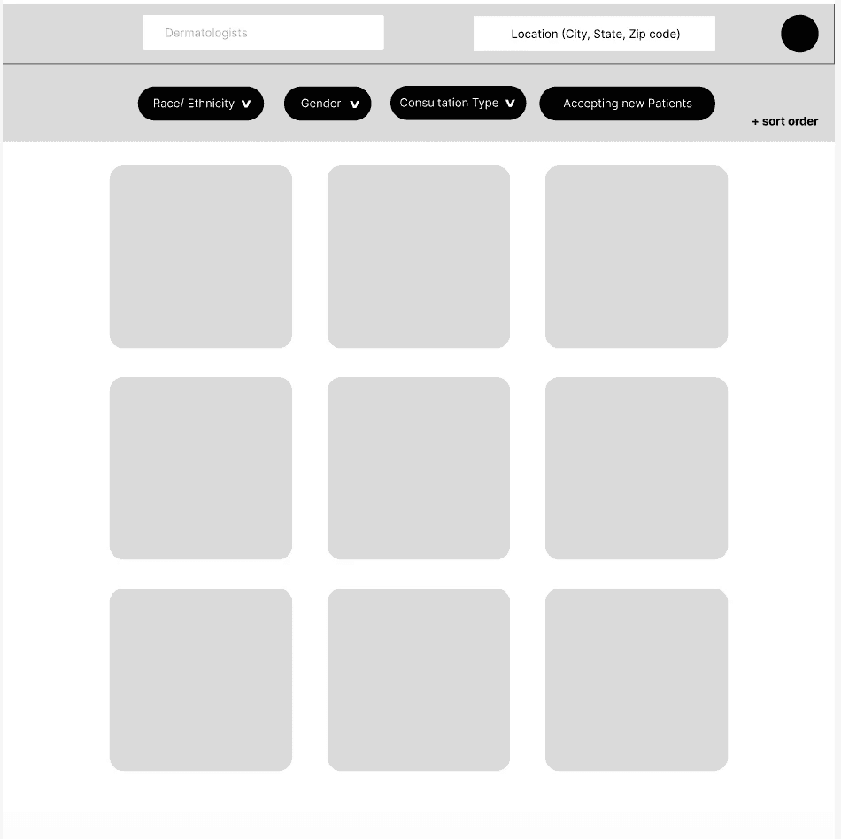
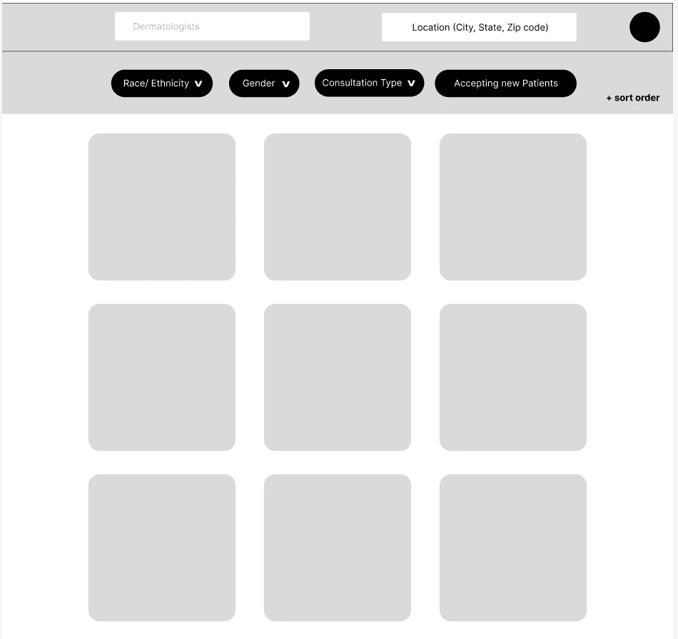
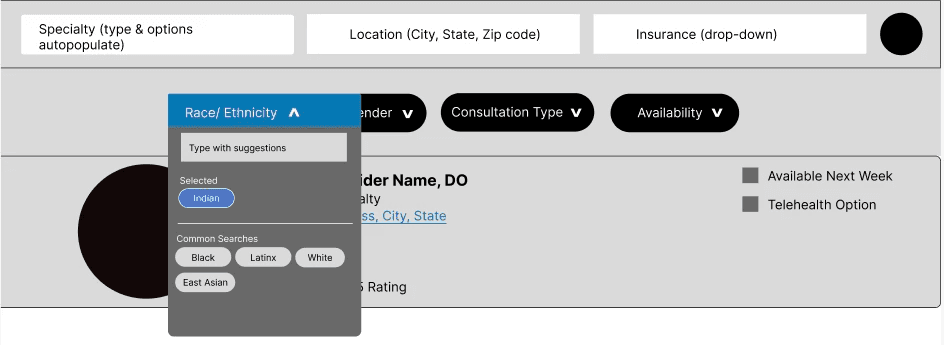
Initial designs prioritized the usage of search filters; however, we decided that the low volume of doctors on our platform (at launch) would render most filters useless – leading to a frustrating experience for the user.
I ideated on ways to further add value to the platform; such as badges to represent doctors who completed HUED's cultural competence education, or patient reviews. However, due to our scope, we aimed to create a minimum viable product (MVP), backlog those features, and reintroduce them once we have more data to inform our decisions.
My priority was to respect users' – both doctors and patients – time. Careseekers would have already explored See my Skin, so we wanted to help them find a dermatologist as efficiently as possible.
High-Fidelity Prototypes and Design System
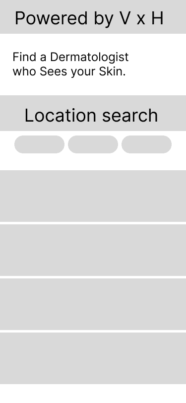
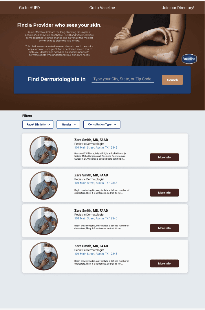
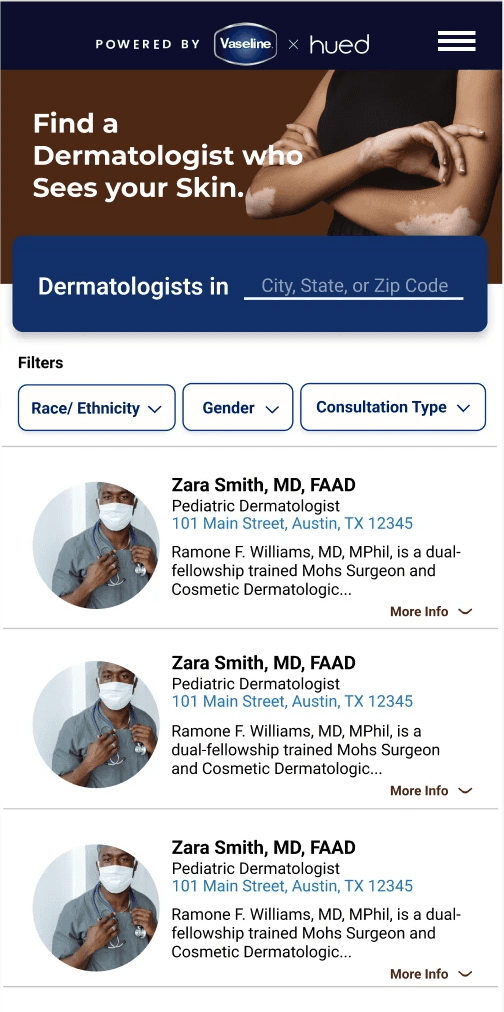
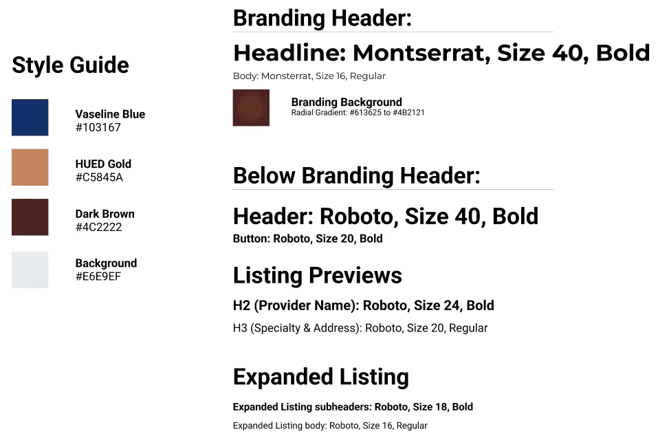
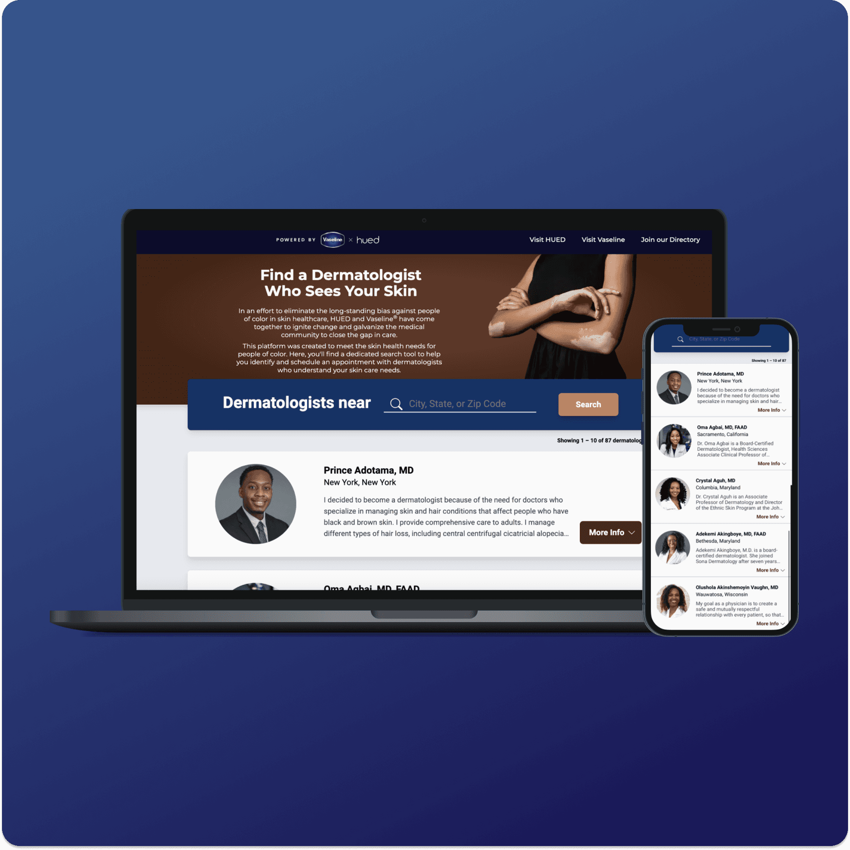
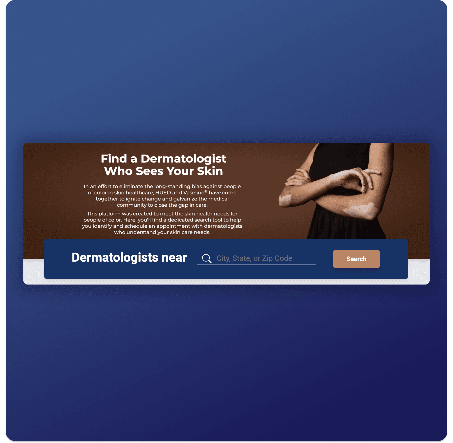
This platform needed to be seamless on both mobile and desktop devices, and we also needed to prioritize branding integration of Vaseline and HUED – hence, the mixture of browns, oranges, and Vaseline blue. I pulled some components from a design system I am currently building for HUED, but also designed and documented new components/ style components for our engineer. The designs evolved greatly over time, due to findings in usability tests and feedback from both internal and external stakeholders.
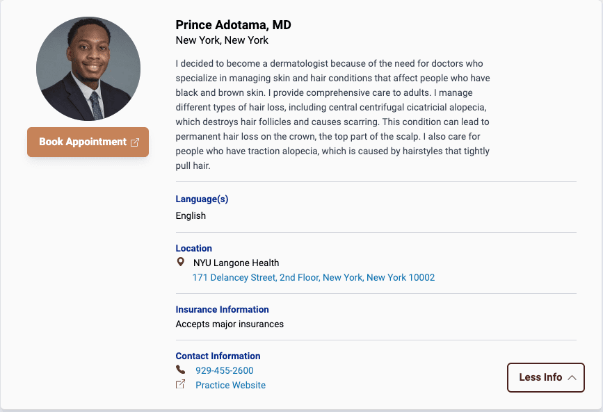
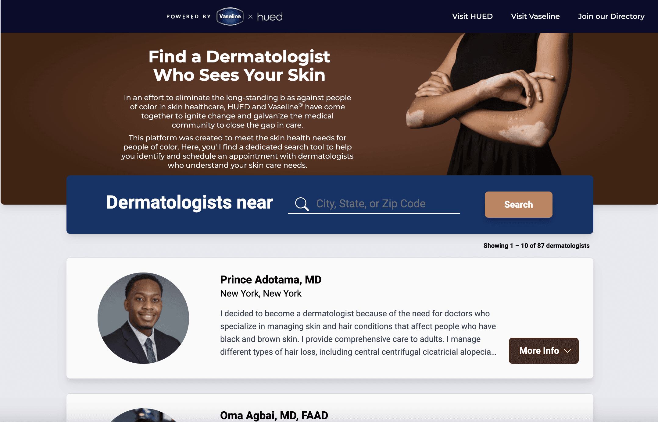
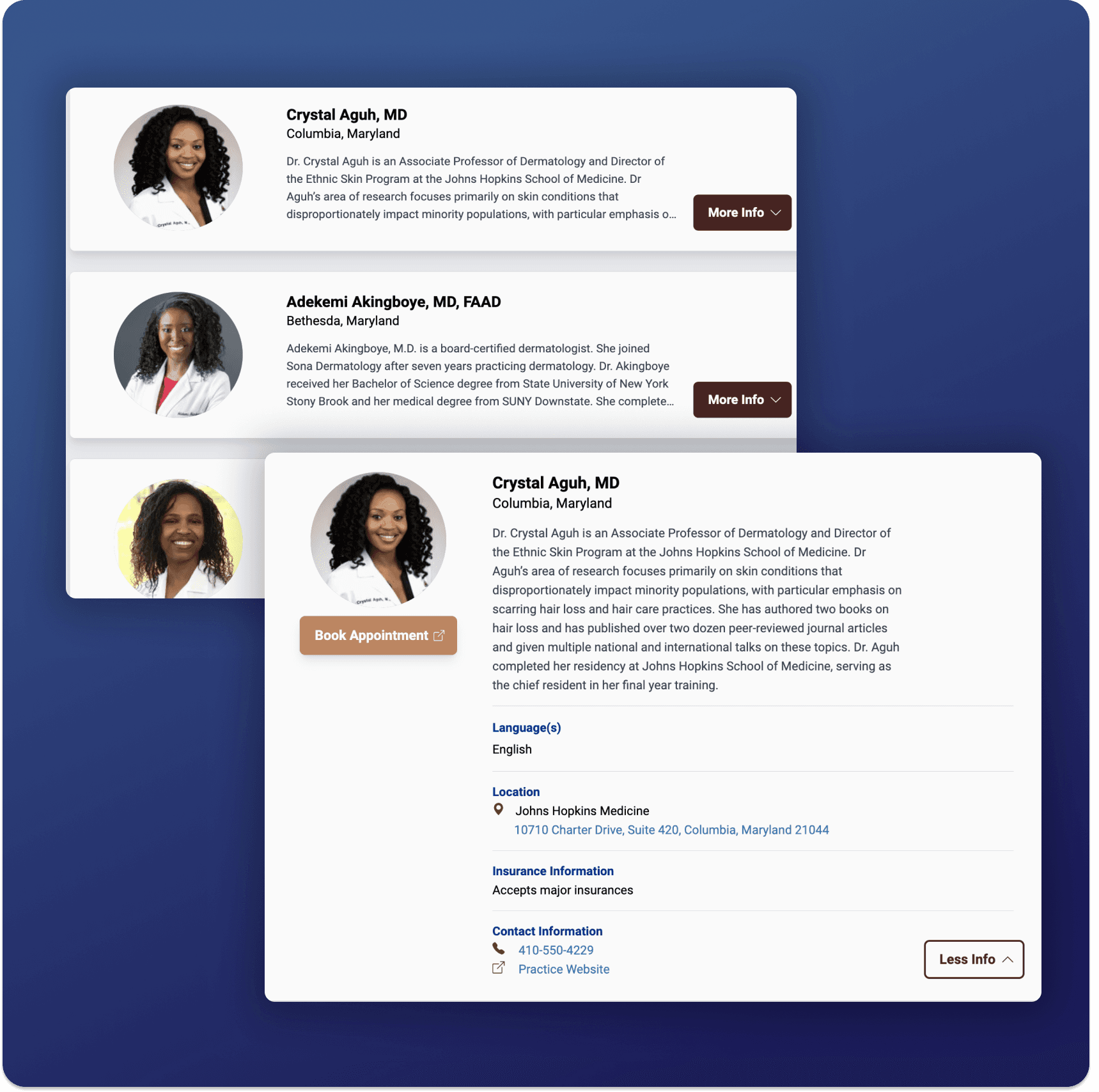
I prioritized a modern, clean design, working closely with our engineer to design the interaction of cards expanding and collapsing. Additionally, I created scalable designs that could accommodate both minimal and extensive practice information.
To streamline my process, I heavily relied on components, auto layout, and Figma's UI styles to maintain a consistent UI.
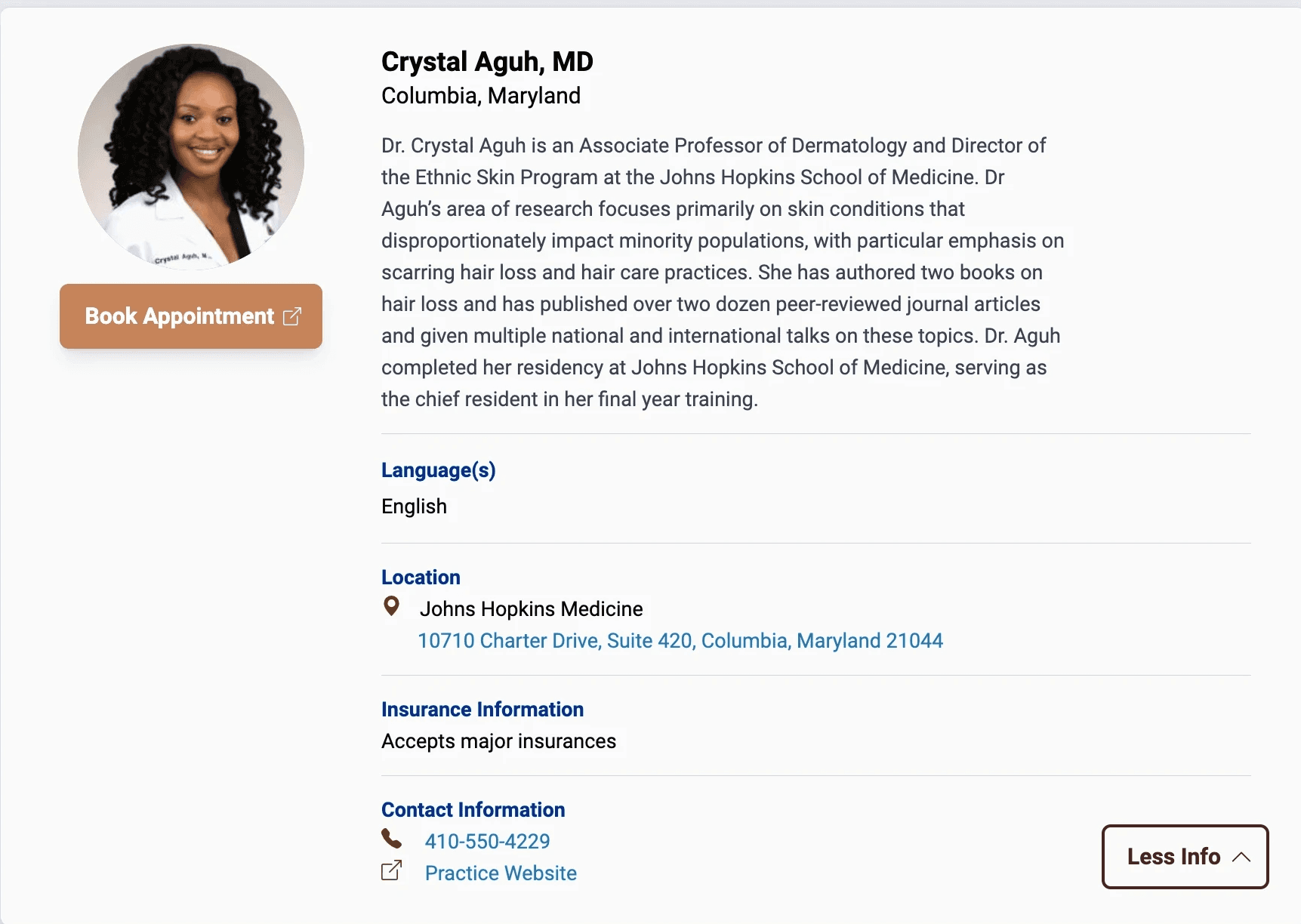
Most of my attention was pointed towards the listing cards – we decided that instead of creating individual pages, we would display expandable cards for each listing. The decrease of real-estate required that only the highest priority information was displayed, and also required a clear and cohesive categorization of the doctor's practice information.
I tested numerous interactions for this listing cards, surveying users to see if clicking the card without a "More/Less" info was intuitive. I also tested placements for that button, the hierarchy of information, and common next steps after viewing a card.
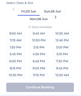
The "Book Appointment" button brings the user to the doctor's preferred booking solution – whether a website, phone number, or email. To clearly communicate the purpose of this button, I included an icon that correlates with the button's destination.
Additionally, I created a style guide to maintain design and engineering alignment, and to create a cohesive omnichannel experience – this style guide informed our marketing materials, email campaigns, and the design of our Skin Equity Resource Hub, also in partnership with Vaseline.
As well as product design, I also served as product owner. I documented heavily in Notion and Clickup, detailing the components on screen, their interactions, new contributions to design system, included features, feature backlog (which I later prioritized and scoped), and QA testing procedures (leveraging my previous experience as a QA tester).
Constraints
Final Designs
Key Takeaways
This project was an exercise in quick, lean, and creative product development. We ideated and experimented but ultimately kept the platform simple to accommodate with strict timeline requirement.
This platform is designed to allow HUED to learn more about our users; we have metric tracking in place to view activity on our site, but we also are planning on speaking with careseekers & providers to learn more about how we can improve their experience.
Honest and constant communication was extremely essential to the success of this project. We needed to maintain trust and transparency with our partner’s agency, and also needed to keep a close Engineer-Designer relationship to address any issues or blockers to the project.
This project required close monitoring and constant adjustment. Due to our tight timeline, my mockups needed to be pixel-perfect, and contain extreme clarity and specificity on the platform’s expected behavior.
Future Opportunities & Next Steps
We planned to launch these designs via A/B Testing; allowing us to quickly validate our assumptions while lowering risk. With such a quick timeline, the team had to make broad assumptions (with some findings from previous research) as to why the conversion rate is so low. I would like to speak directly with users, conduct usability tests, and dive deeper into the quantitative metrics to find out what may have been preventing users from booking with Spruce – therefore, we can adequately address the problem and see an increase in KPIs.
Because we created new components, and also introduced new interactions and functionalities onto our apps, I would prioritize creating documentation for our design system – defining when, where, and how the new components should be used, which would allow us to maintain consistency on other screens of the app.
We completed this design sprint in tandem with both Product and Engineering establishing the scope and tech requirements. For example, we pivoted three times during this project – we initially were tasked with designing the homescreens, switched to designing the interface of a homescreen customization tool for our marketing teams, and then pivoted back to designing three homescreens (due to our timeline).
