Spruce
Increasing bookings at Spruce through a personalized homescreen experience.
Skills demonstrated: Rapid Prototyping, Mobile Design, UX Strategy, Cross-Functional Collaboration


Project Overview
Industry
Home Services
Timeline
2 weeks
Team
2 Product Designers, Head of Product, Product Manager, Engineering Team, Marketing Team
Spruce is a mobile and web app that enables residents of multifamily communities to book housekeeping services with local providers.
As a Product Designer at Spruce, I was tasked with designing a more effective and personalized experience on the app's homescreen.
With only two weeks to simultaneously establish product strategy, scope tech feasibility, and submit completed designs, this project served as "Step 1" for a larger, more robust homescreen/ app redesign in the following year. The other product designer and I worked dutifully to ensure that this project successfully set the foundation for the following updates, by balancing design decisions with long and short-term goals.
Problem
Spruce faced declining conversion rates among new and lapsed (have not booked within 30 days) users, prompting the need for an enhanced user experience.
Problem
Spruce faced declining conversion rates among new and lapsed (have not booked within 30 days) users, prompting the need for an enhanced user experience.
Problem
Spruce faced declining conversion rates among new and lapsed (have not booked within 30 days) users, prompting the need for an enhanced user experience.
Solution
Increase bookings and instill user confidence by designing a Personalized Homescreen to provide more context, clarify product offerings, and create a more curated user experience.
Solution
Increase bookings by designing a Personalized Homescreen to provide more context, clarify product offerings, and create a more curated user experience.
Solution
Increase bookings and instill user confidence by designing a Personalized Homescreen to provide more context, clarify product offerings, and create a more curated user experience.
Results
Results
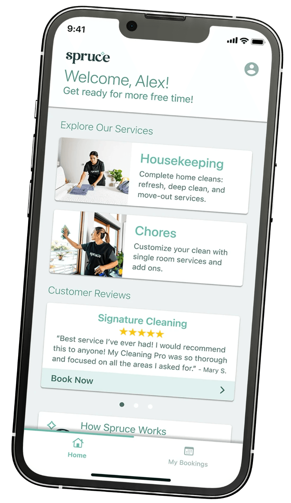


Designs successfully launched in October 2023
Designs successfully launched in October 2023
Designs successfully launched in October 2023
Created blueprint for 2024 app redesign
Created blueprint for 2024 app redesign
Created blueprint for 2024 app redesign
Successfully established cross-functional product development workflows
Successfully established cross-functional product development workflows
Successfully established cross-functional product development workflows
Discovery & Research
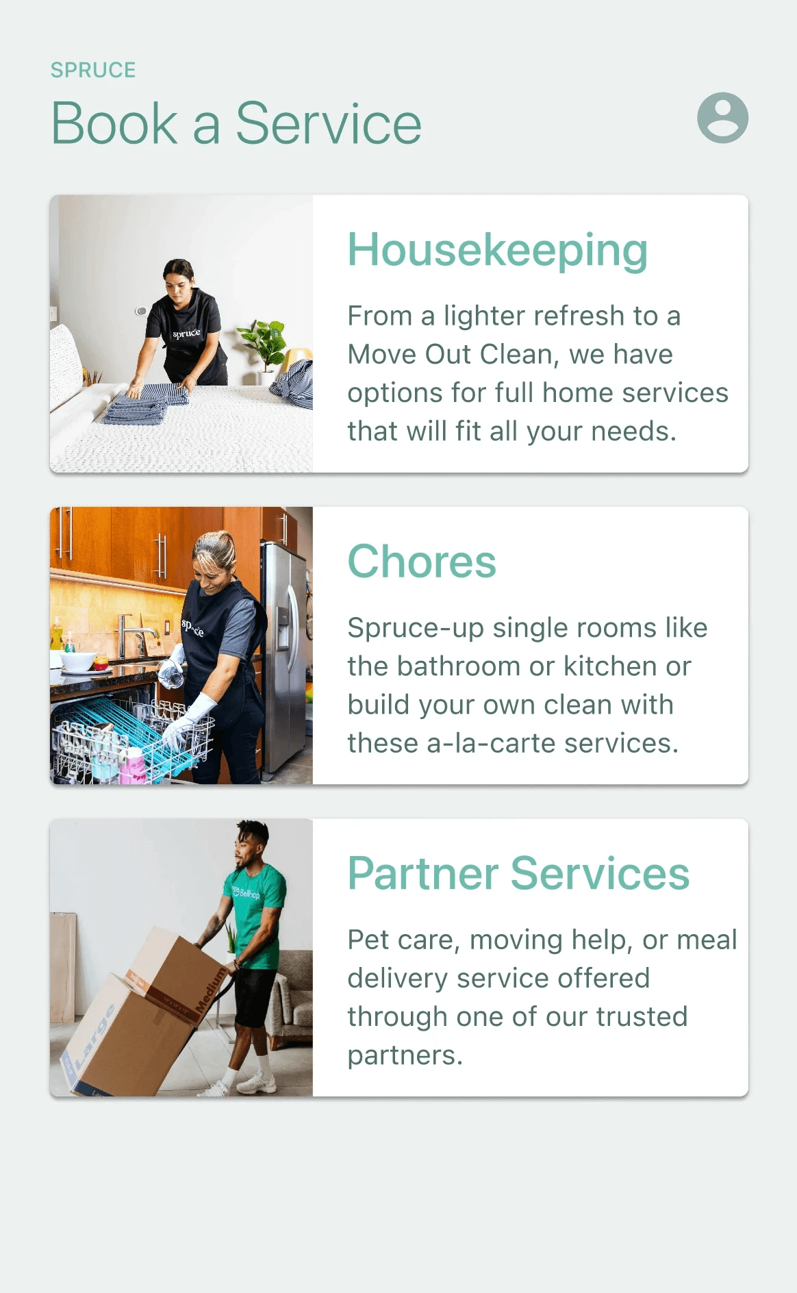
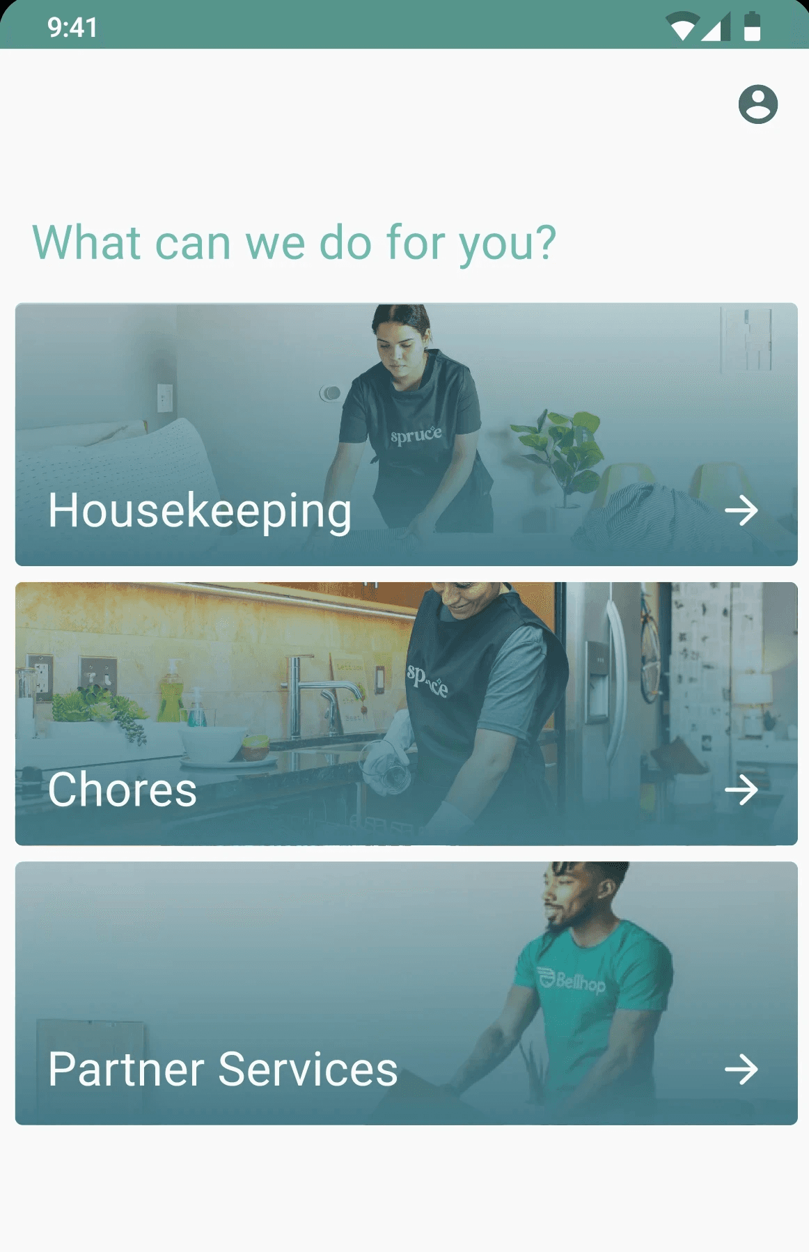
Spruce's original static homescreen only displayed its three core service offerings. We saw an opportunity to bring more value to this screen.
What is causing this low booking rate?
What is causing this low booking rate?
Moving quickly and dynamically to gain a thorough understanding of the problem, I interviewed potential users and reviewed data from previous marketing surveys. I also spoke to key team members in the Operations and Customer Support departments to gain additional insight on common user complaints, as well as the Marketing Team to learn what previous initiatives attempted to increase our booking rate.
The other Product Designer and I shared key data points, interview insights, user flows from other similar apps, and ideas in a FigJam file.
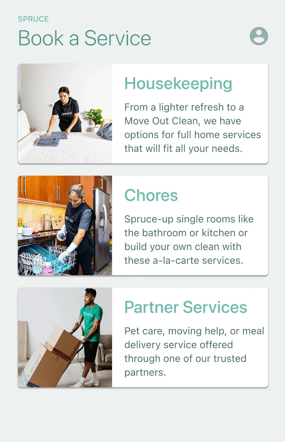
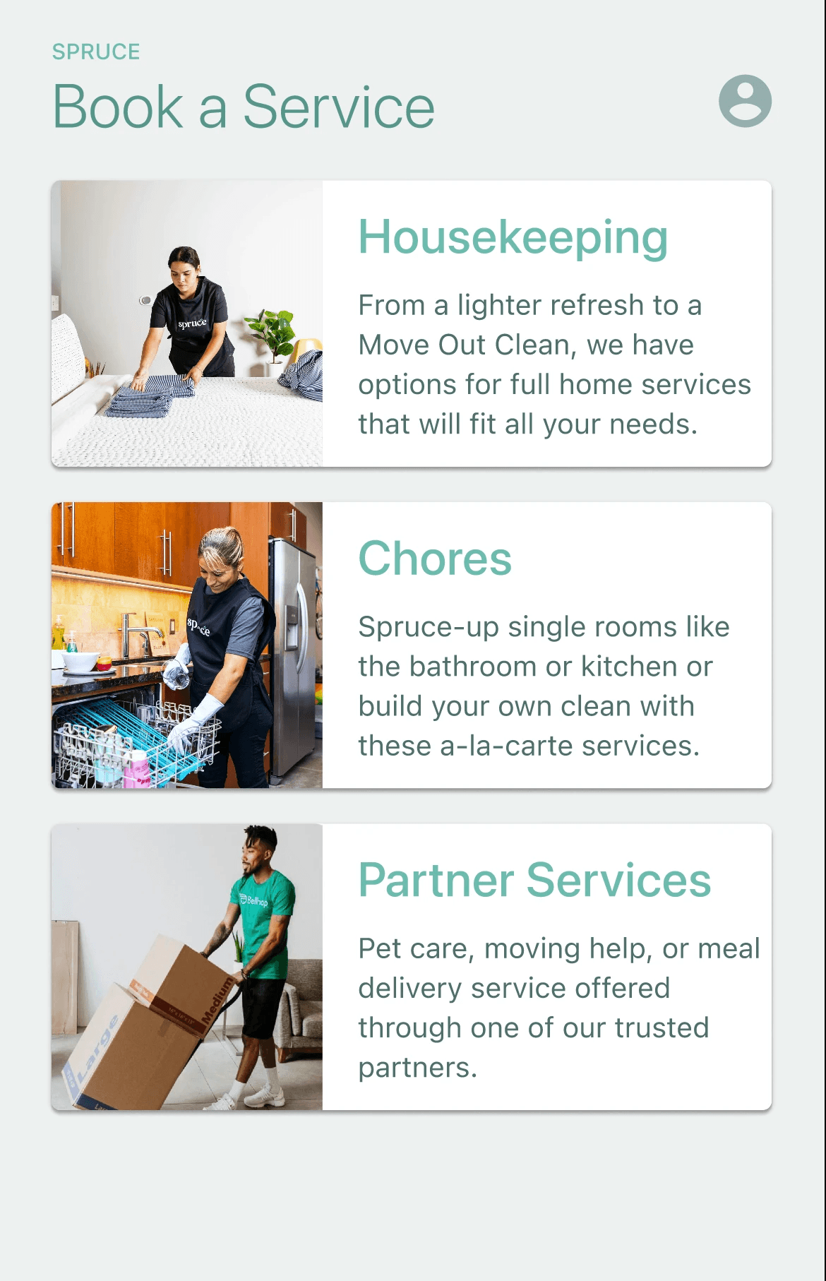

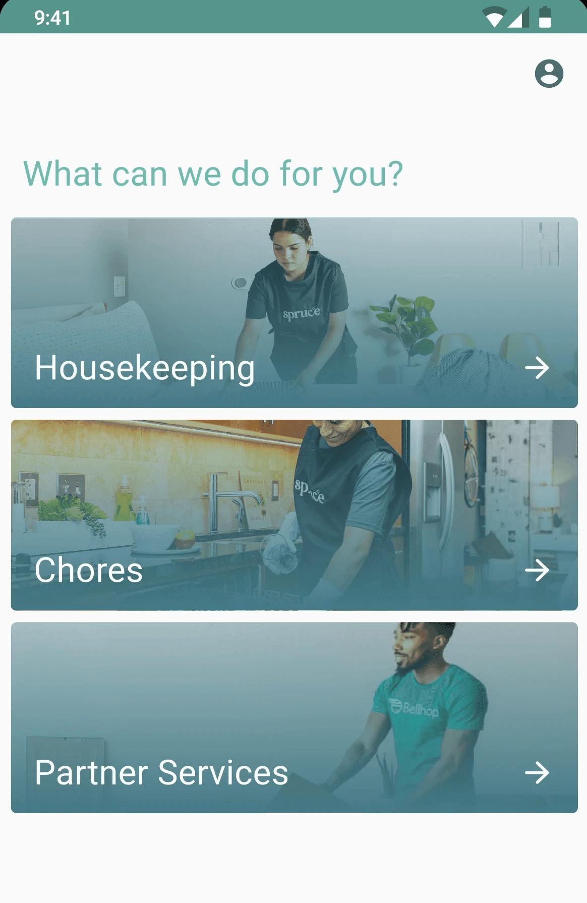

Spruce's original static homescreen only displayed its three core service offerings. We saw an opportunity to bring more value to this screen.
Moving quickly and dynamically to gain a thorough understanding of the problem, I interviewed potential users and reviewed data from previous marketing surveys. I also spoke to key team members in the Operations and Customer Support departments to gain additional insight on common user complaints, as well as the Marketing Team to learn what previous initiatives attempted to increase our booking rate.
The other Product Designer and I shared key data points, interview insights, or user flows from other similar apps in a FigJam file.
How can we improve our homescreen to increase bookings?
How can we improve our homescreen to increase bookings?
With a clearer understanding of the problem, we regrouped with Product and Engineering to prioritize, strategize, and outline our solution. Our rapid timeline warranted post-launch testing; the following solutions served as our hypotheses, and we planned to conduct A/B Testing and additional user interviews post-launch to validate our assumptions. We believed that the following strategies would increase our booking rate, and improve the user experience of our homescreen:
1
Promote “recommended services”, driving users to our most popular services directly via our homepage.
REASONING
Users reported feeling confused about Spruce's offerings, and did not understand the value proposition of our services. With such a minimal homescreen, we were not currently providing enough context to our users.
2
Segment users based on activity levels to specifically display content that is most relevant to them.
REASONING
Users were not presented with information that addressed their activity with Spruce, such as upcoming bookings, previous bookings, or new user information. Interviews with potential users, revealed an interest in “Recently Purchased” or “Your booking is soon” sections in other similar apps.
3
Prominently display coupons and current promotions to incentivize users to book quickly.
REASONING
Marketing data showed a significant increase in bookings after email campaigns with relevant coupons on promotions. The old homescreen did not yet have a channel for marketing to run similar campaigns on the app.
UI & Interaction Design
We employed rapid protoyping, creating numerous design iterations and collaborating heavily with cross-functional teammembers to create, present, and validate our designs.
We frequently met with engineering and product team members to ensure the feasibility of our designs, and constantly received feedback from other team members to inform our next iteration.
The other product designer and I each designed UIs on Figma, providing consistent feedback asynchronously and building off of each other’s ideas and suggestions. We were incredibly iterative in our designs, designing close to 30+ screens to test out different layouts, color schemes, and interactions.
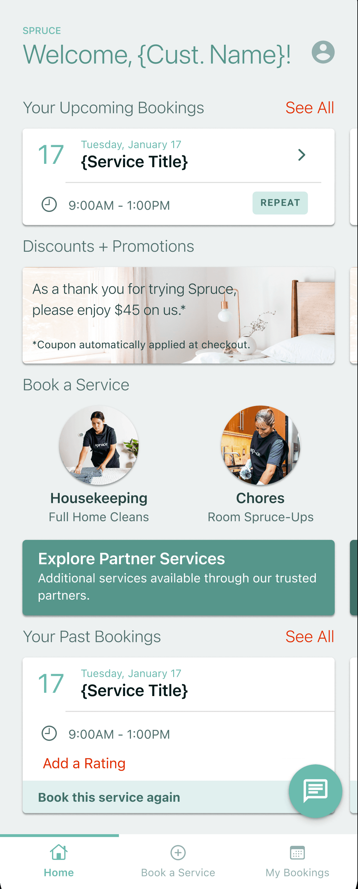

In our early iterations, we recognized cluttered visuals and a confusing hierarchy. We continued iterating to find a more seamless, intuitive, and scalable solution, focusing on designing swipeable cards to reduce home screen clutter and personalized the interface with the customer's name and booking details.
In our early iterations, we recognized cluttered visuals and a confusing hierarchy. We continued iterating to find a more seamless, intuitive, and scalable solution, focusing on designing swipeable cards to reduce home screen clutter and personalized the interface with the customer's name and booking details.
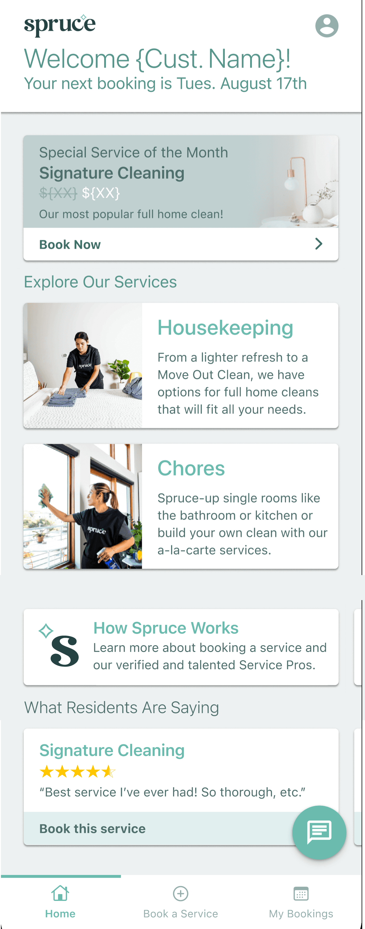
Later iterations introduced a Welcome Message container to provide a cleaner concierge experience, as well as a persuasive value prop for the respective user segment at the top of the screen. We used color more sparingly and focused on displaying only the most important elements for that user's journey.
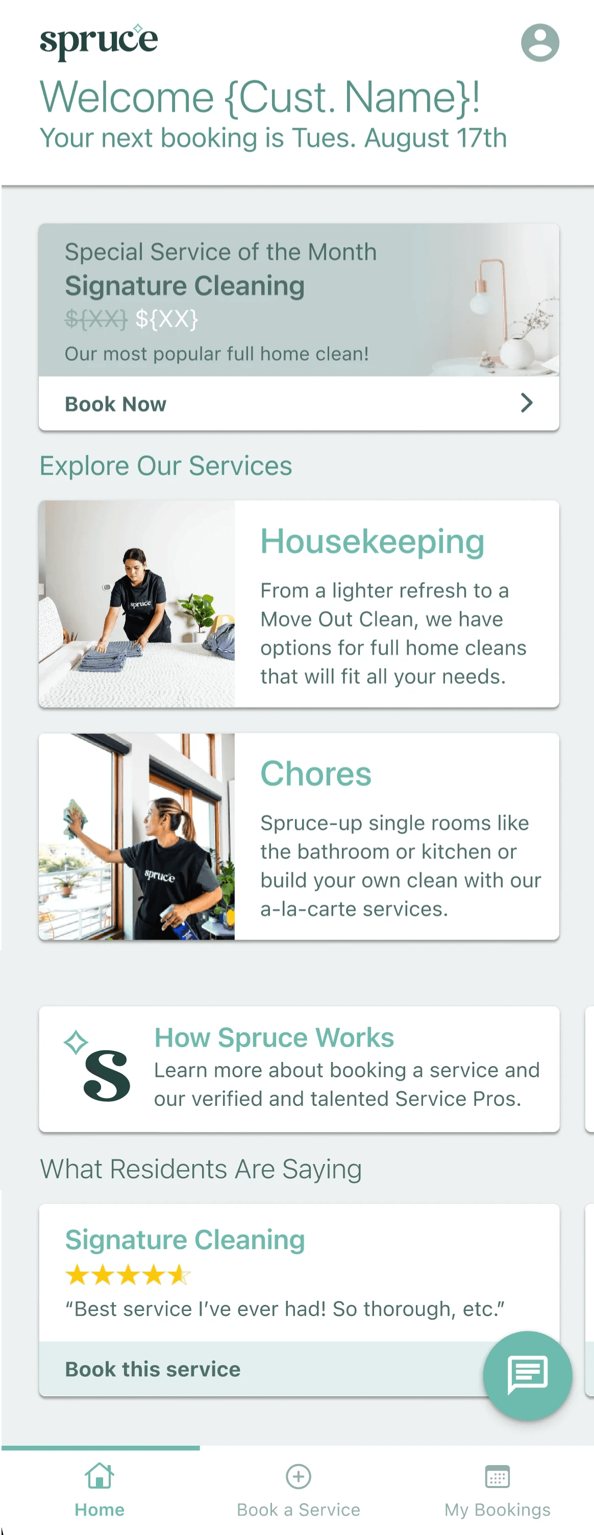
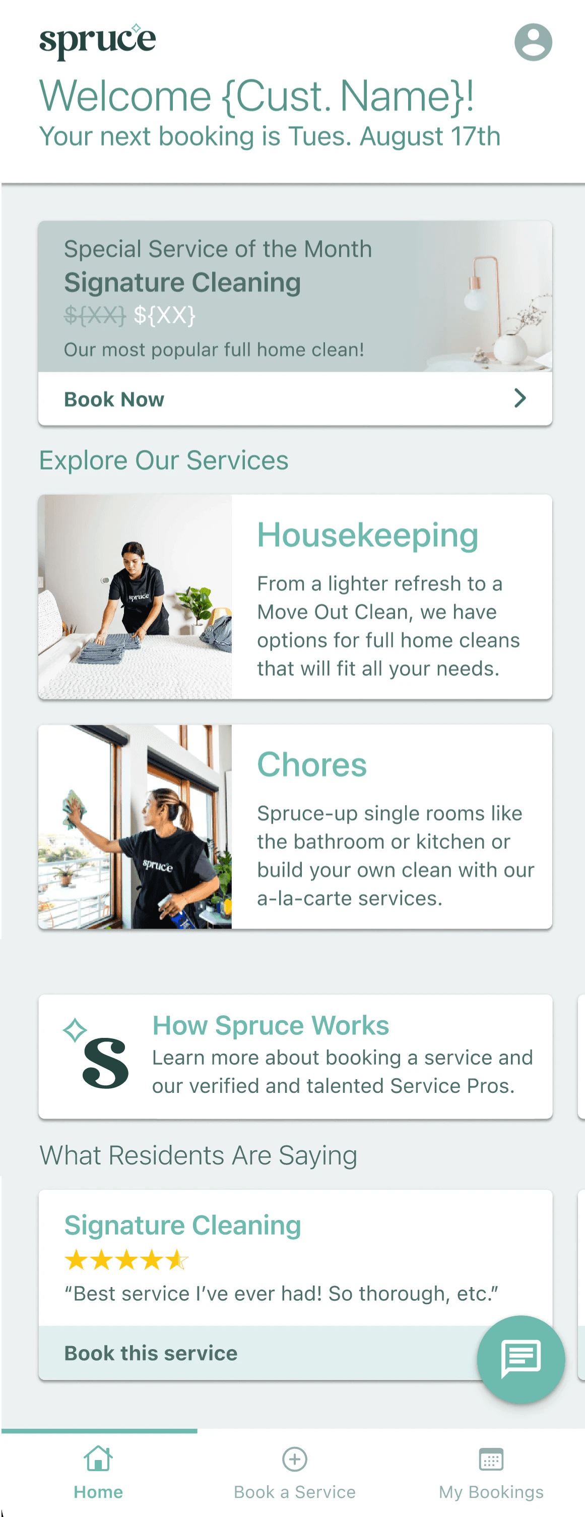
Later iterations introduced the Welcome Message card to provide a cleaner concierge experience, as well as a persuasive value prop for the respective user segment at the top of the screen. We used color more sparingly and focused on displaying only the most important elements for that user's journey.
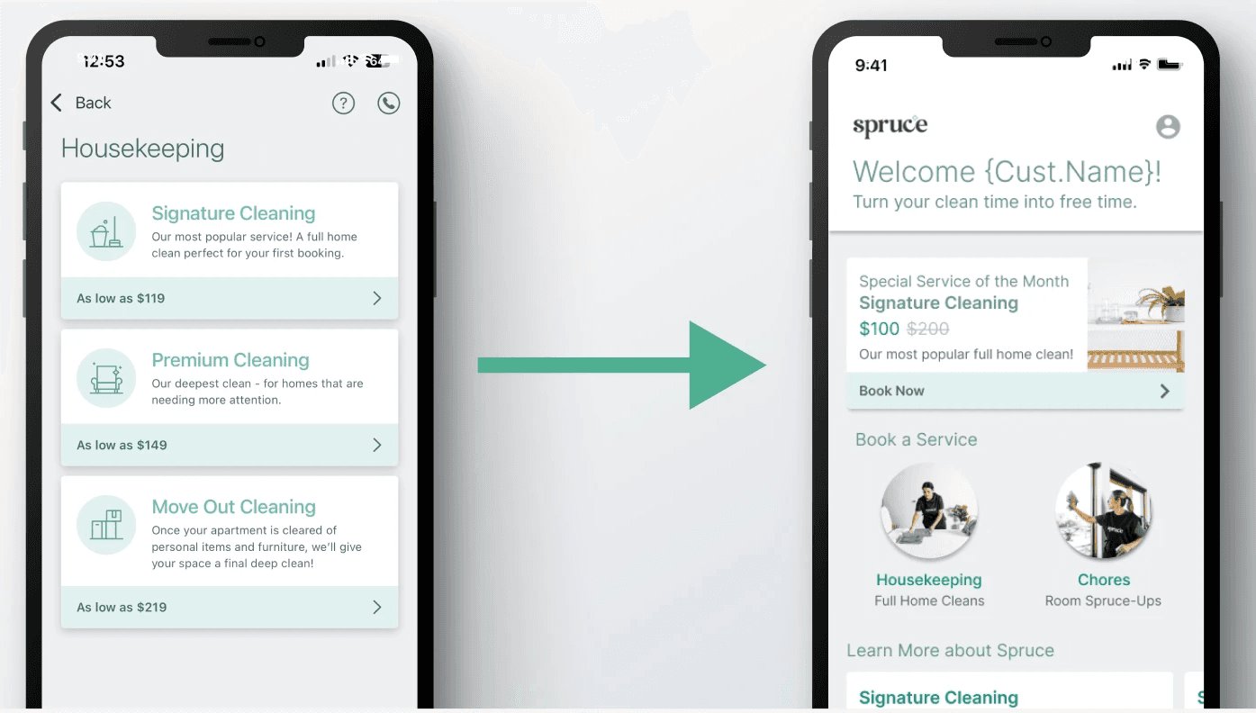


We pulled from existing components in other screens of the app, and adjusted as needed to match the new functionality of the homescreen.
Using our existing design system, iOS, and Android components streamlined the design and engineering process, allowing us to curate a clear design language for our users, and maintain alignment with our engineers.
Auto-layout was integral in maintaining the proper layout, spacing, and padding for each component, ensuring consistency of visual elements, ease of adjusting specific design atoms, and flexibility to iterate.
We also wanted the iOS, Android, and Web platforms to look as similar as possible, while also addressing the affordances of each platform.
Final Designs
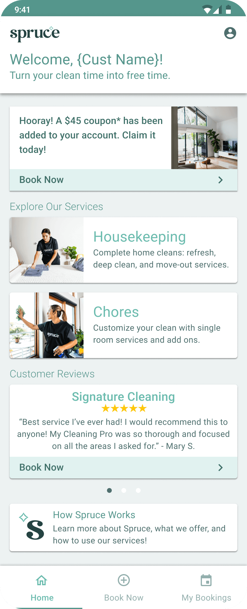


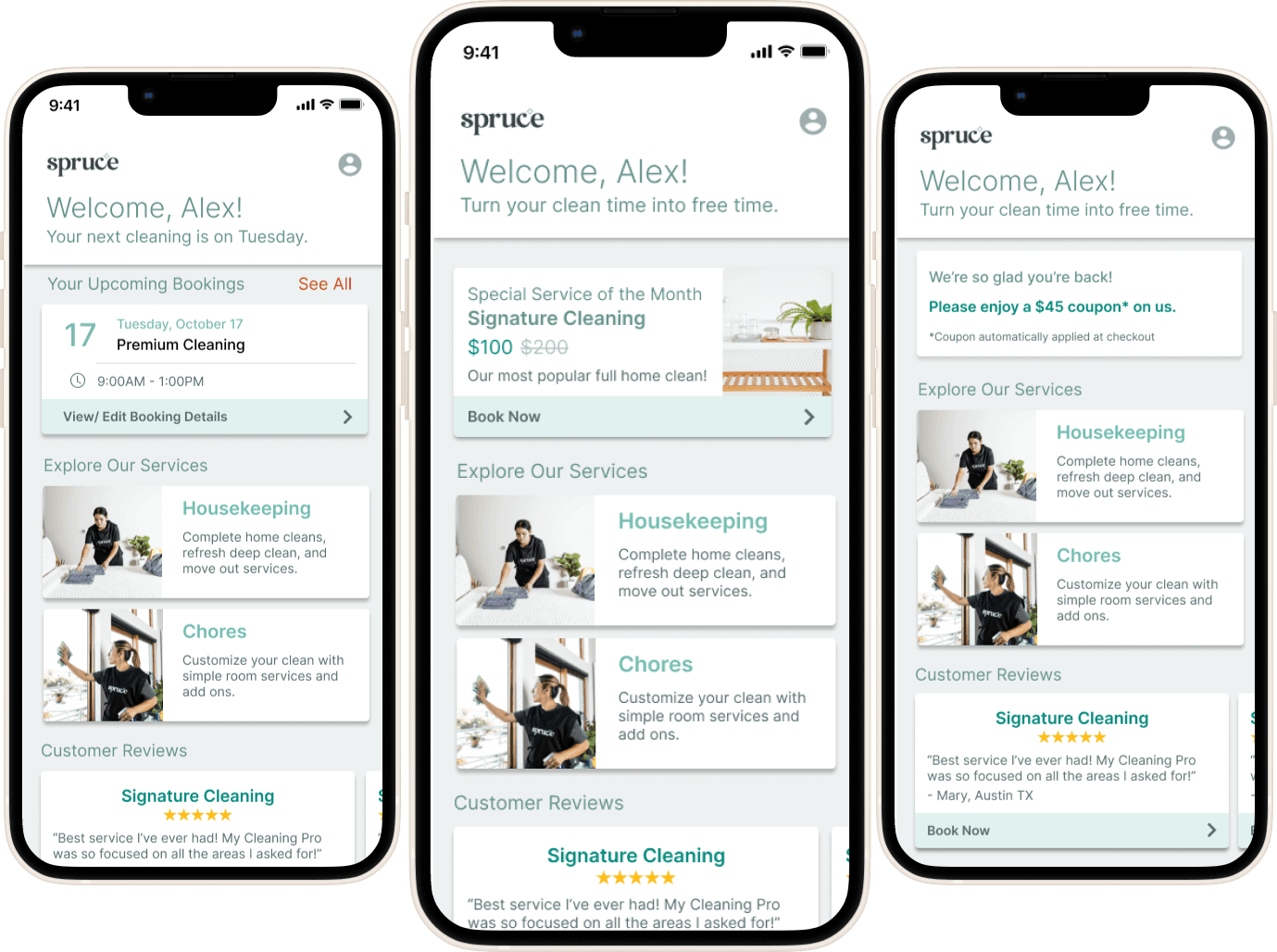
Android screen for new users.
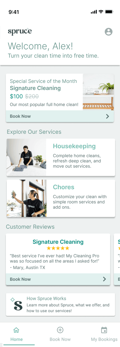


iOS screen for new users.
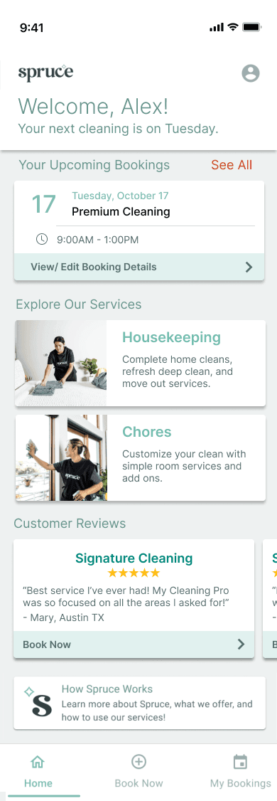


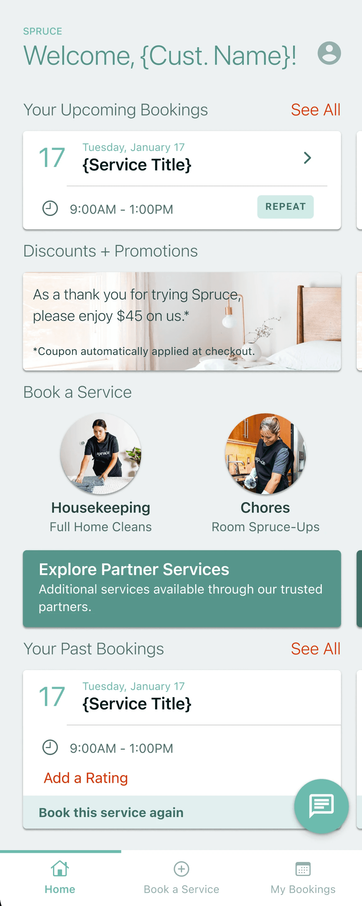
iOS screen for active users.
Minimalist Design
We heavily utilized hierarchy, colors, and typography to quickly communicate important information to the user, and seamlessly guide them through the new app experience.
Why?
We wanted this design to provide value in their user journey, rather than provide unnecessary visual clutter.
Competitor research revealed that many homescreens present too many options to users, leading to confusion on how to proceed through the app.
Spruce's style guide strives for a clean interface and visual identity.
Skimmable
While we needed to show the user relevant information, users are not likely to spend an extended amount of time reading the contents of a homescreen. So, we needed to user hierarchy, color, and clear and concise copy to quickly signal the user to where they need to go.
Skimmable
While we needed to show the user relevant information, users are not likely to spend an extended amount of time reading the contents of a homescreen. So, we needed to user hierarchy, color, and clear and concise copy to quickly signal the user to where they need to go.
Skimmable
While we needed to show the user relevant information, users are not likely to spend an extended amount of time reading the contents of a homescreen. So, we needed to user hierarchy, color, and clear and concise copy to quickly signal the user to where they need to go.
Action-focused
The purpose of our home screen is to bring the user to a more relevant page on the app (booking a service, editing a booking, etc.) We planned to display incentives to book, such as coupons or current promotions, as well as cards that direct users to where they are likely to go based on their activity levels with Spruce.
Challenges
Timeline
This project was initially scoped as a 6-month exploratory design/ development initiative, but was condensed into a 2 week design sprint. We, therefore, needed to utilize our existing resources and data to inform our design decisions. My experience in startups equipped me with the ability to successfully prioritize and make necessary tradeoffs to ensure we launched a valuable update that could inform our next steps.
Cross-Functional Collaboration and Stakeholder Management
With the decision to engage the Marketing Department in this project (due to their knowledge of user behavior), we needed to quickly, but thoughtfully, present our designs, provide critical updates, and receive feedback from four departments (Product, Engineering, Design, and Operations). With the quick timeline, we shared our designs early and often to allow all four departments to provide necessary feedback.
Scope and Tech Capabilities
We completed this design sprint in tandem with both Product and Engineering establishing the scope and tech requirements. For example, we pivoted three times during this project – we initially were tasked with designing the homescreens, switched to designing the interface of a homescreen customization tool for our marketing teams, and then pivoted back to designing three homescreens (due to our timeline).
Future Opportunities & Next Steps
Validate Assumptions
We planned to launch these designs via A/B Testing; allowing us to quickly validate our assumptions while lowering risk. With such a quick timeline, the team had to make broad assumptions (with some findings from previous research) as to why the conversion rate is so low. I would like to speak directly with users, conduct usability tests, and dive deeper into the quantitative metrics to find out what may have been preventing users from booking with Spruce – therefore, we can adequately address the problem and see an increase in KPIs.
Expand Capabilities
We created future plans to expand our Customer Reviews viewing experience, allow users to quickly edit bookings, and spotlighting specific services without leaving the homescreen.
Expand Capabilities
We created future plans to expand our Customer Reviews viewing experience, allow users to quickly edit bookings, and spotlighting specific services without leaving the homescreen.
Expand Capabilities
We created future plans to expand our Customer Reviews viewing experience, allow users to quickly edit bookings, and spotlighting specific services without leaving the homescreen.
Design System Documentation
Due to the expansion of our design system, I would want to create documentation explaining the new design patterns, and when they should strategically be used. This could help any future designers onboard onto our team, and can also increase transparency with the engineering team.
Project Overview
Industry
Home Services
Timeline
2 weeks
Team
2 Product Designer, Head of Product, Product Manager, Engineering Team, Marketing Team
Spruce is a mobile and web app that allows residents of multifamily communities to book housekeeping services with local providers.
As a Product Designer at Spruce, I was tasked with designing a more effective and personalized experience on the mobile and web app's home screen.
With only two weeks to establish product strategy, tech feasibility, and submit completed designs, this project served as "Step 1" for a larger, more robust homescreen/ app redesign in the following year. The other product designer and I worked dutifully to ensure that this project successfully set the foundation for the following updates, by balancing design tradeoffs with long-term and short-term goals.
Project Overview
Spruce is a mobile and web app that enables residents of multifamily communities to book housekeeping services with local providers.
As a Product Designer at Spruce, I was tasked with designing a more effective and personalized experience on the app's homescreen.
With only two weeks to simultaneously establish product strategy, scope tech feasibility, and submit completed designs, this project served as "Step 1" for a larger, more robust homescreen/ app redesign in the following year. The other product designer and I worked dutifully to ensure that this project successfully set the foundation for the following updates, and balanced long-term decisions with short-term tradeoffs.
Industry
Home Services
Timeline
2 weeks
Team
2 Product Designers, Head of Product, Product Manager, Engineering Team, Marketing Team
Let's Chat!
Looking for UX, UI, or strategic support for your startup, small business, or independent project? I am always happy to chat and help elevate your user and product experience!
Let's Chat!
Looking for UX, UI, or strategic support for your startup, small business, or independent project? I am always happy to chat and help elevate your user and product experience!
Designed by Kiana Cozier, 2024
Designed by Kiana Cozier, 2024
